2024⼁Mobile⼁UI/UX design⼁By Hengqing
Duration
5 days
My Role
Designer
Collaborator
Methods
Google venture (GV) design sprint process, “expert” interview, affinity map, competitor research, sketch, storyboard, prototype, usability testing.
Problem
Savr is a recipe app for home chefs. They had seen negative reviews that users struggled with instructions, timing, dirty-hand interactions, etc.
Solution
I redesigned Savr’s cooking instruction flow, streamlined it with hands-free controls, parallel timers, and prep-stage prompts.
Result
The testing showed significant improvements in user satisfaction:
100% completion during tests.
Majority positive responses regarding clarity and ease of use.
My Learning (Read more)
Value of bold, rapid experimentation.
Be flexible with the design processes.
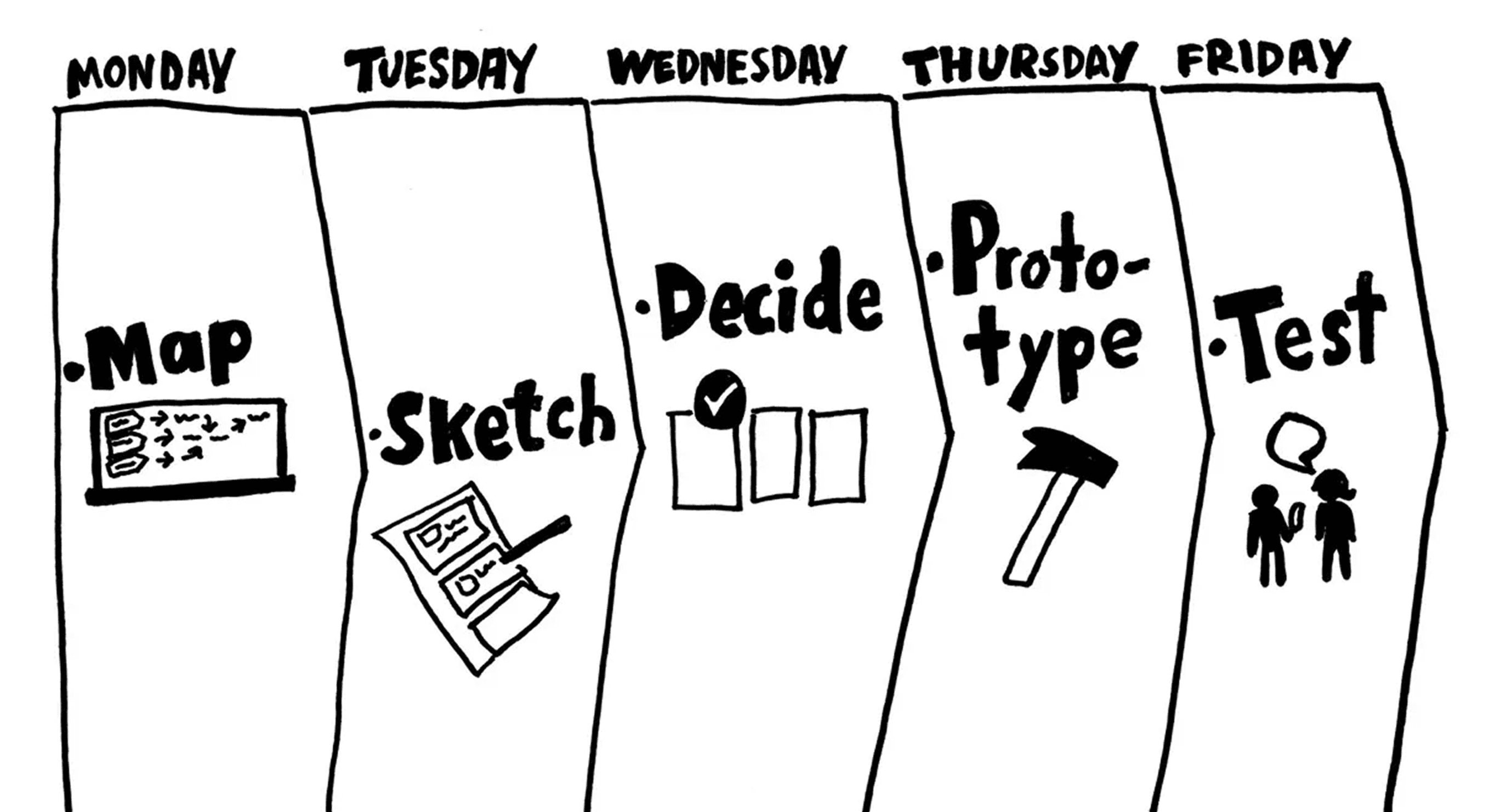
Day 1: Understand/Map
—Defining the Problem
design constraints
Currently, recipes are written as text, in ordered steps from start to finish.
Your solution should be designed as a feature for the Savr Recipes native mobile app.
Focus on creating a better experience for users when it’s actually time to cook it! (Users have expressed positive feedback about finding quality recipes)
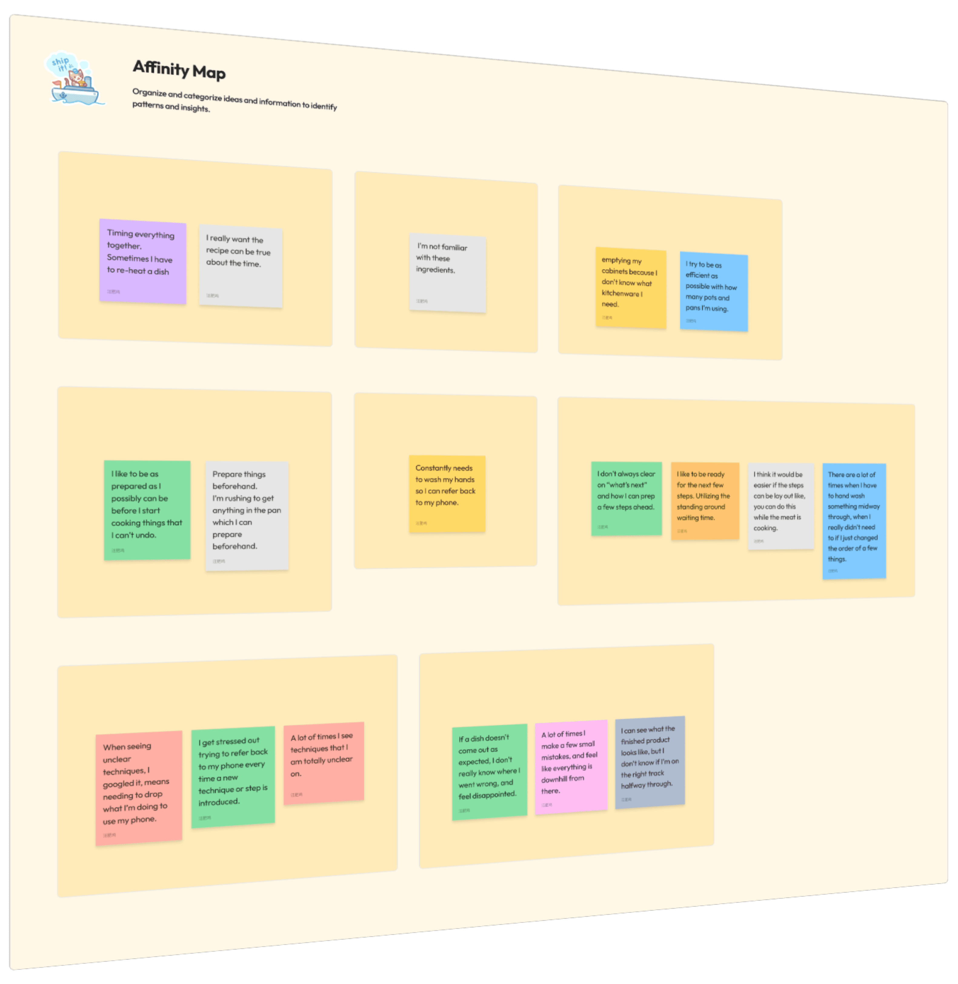
“Expert Interviews” (User Voices)
Affinity Mapping (Synthesizing Insights)
Before Cooking
Inaccurate Recipe Timings: Recipe listed timings were often off.
No Preparation Stage: Savr didn't clearly communicate tasks users could perform before cooking, causing avoidable delays.
During Cooking
Interaction Difficulties: Users struggled with interacting or referring back to their phones while cooking due to messy or wet hands.
Lack of Ability to Work Parallel: Many experience waiting times that could be used for preparing future steps to avoid rushing later.
Unclear Techniques: New or unclear techniques mentioned in the instructions created stress and frustration mid-cooking.
When Mistakes Occurred
No Midway Check-ins: Users often wondered if they were still on the right track during cooking.
Unclear Mistake Recovery: Users didn't know at which step they went wrong after a dish turned out unexpectedly, preventing learning and improvement.
Maria
Dan
Silvia
Anthony
Ron
Alessandro
By the end of Day 1, I had a clear user problem map of the cooking experience on Savr. With these insights, I was ready to explore solutions that could restore ease and joy to home cooking on Day 2.
Day 1 of the GV Design Sprint is all about understanding the problem space, empathize with the users, and mapping out the core challenge to tackle during the sprint.


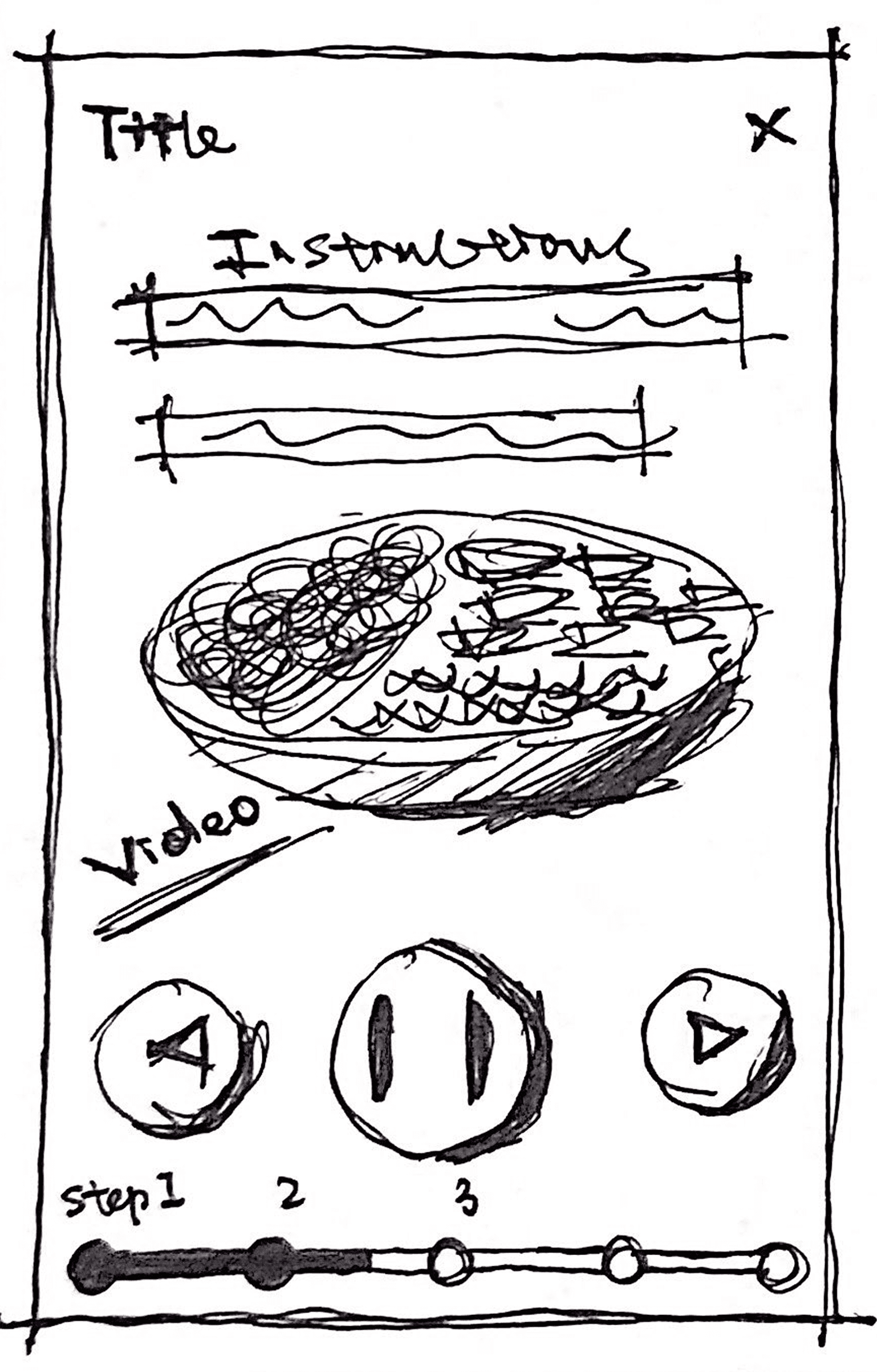
Before starting to cook
Main cooking instruction screen
Completion screen


By the close of Day 2, I had some clear concepts and directions to pursue, with each tackling the problems revealed through Day 1. The next step would be to decide and refine one of the concepts.
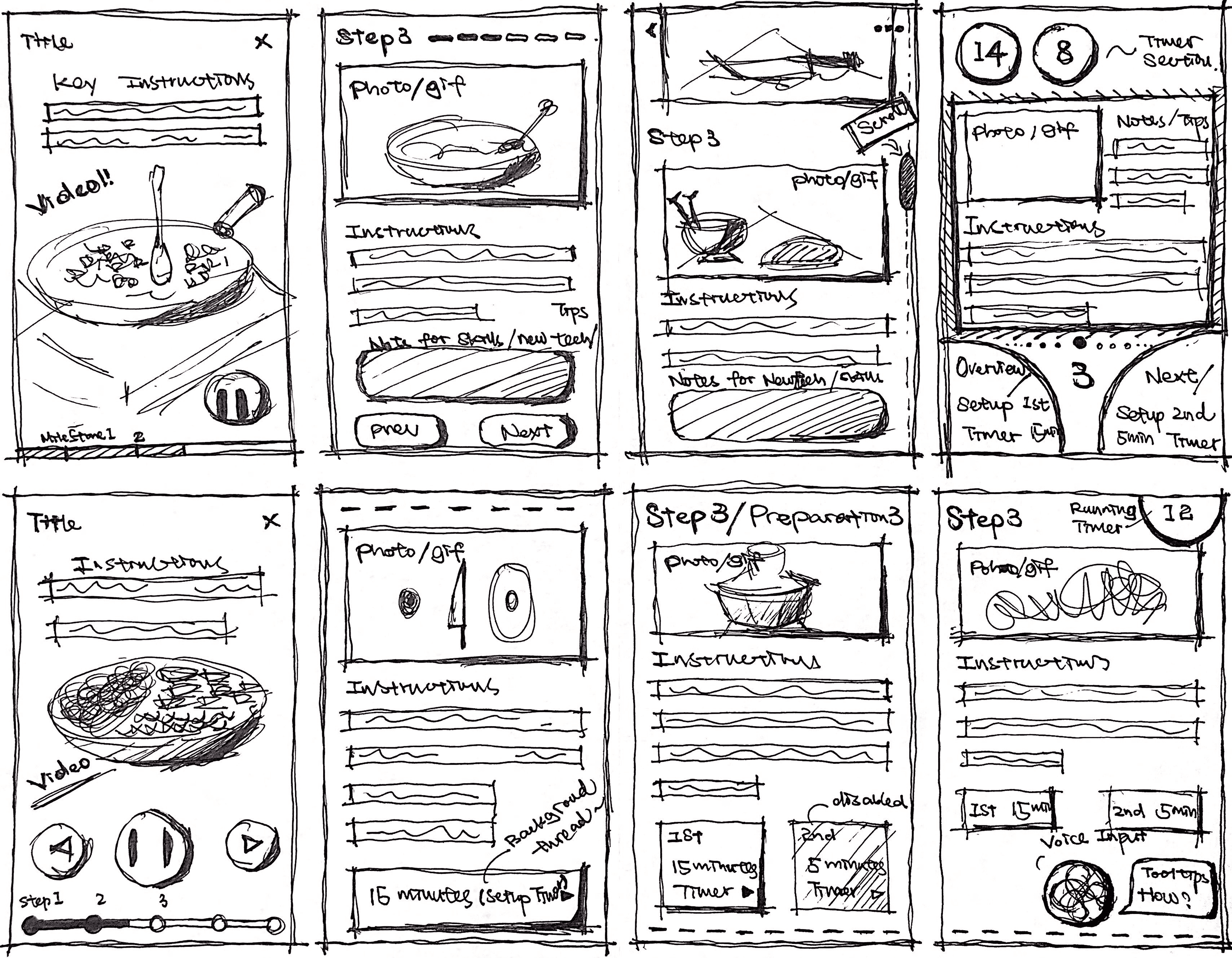
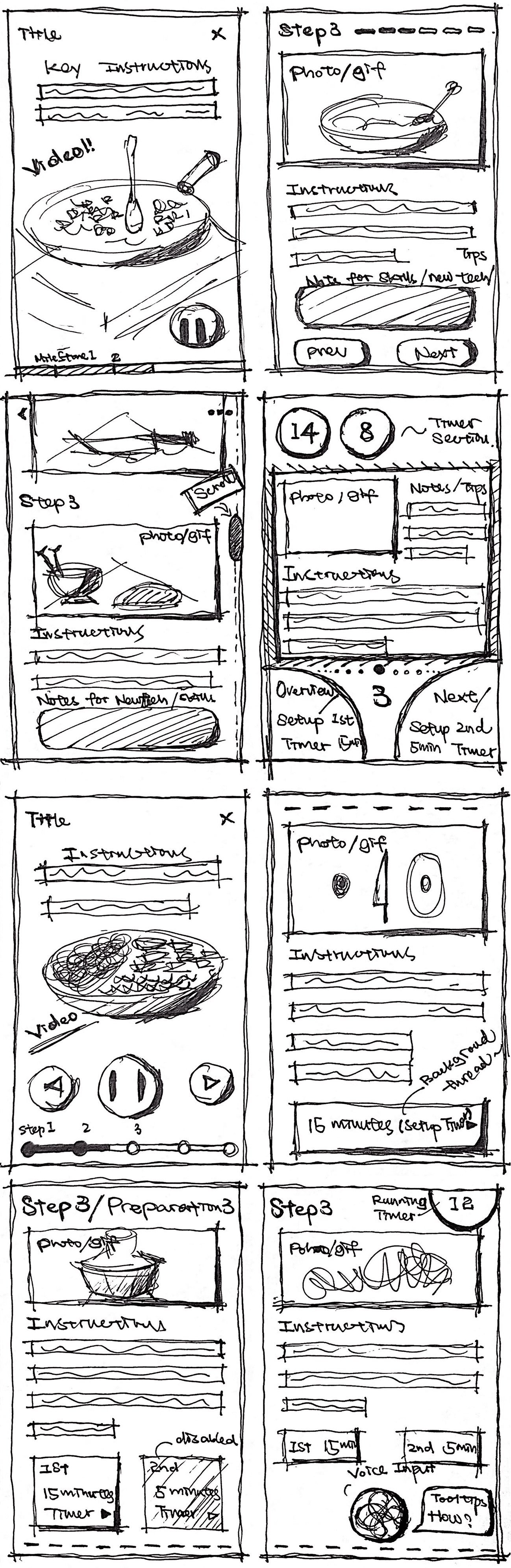
Day 2 of the GV Design Sprint is all about diverging on ideas and visualizing them.

(Option 3 – voice control)
Option 3: Introduce the voice control based on the option 2
(Option 2 – integrated timer)
Option 2: Set the timer as a background thread while continuing with the main flow

Option 1: Rely heavily on videos
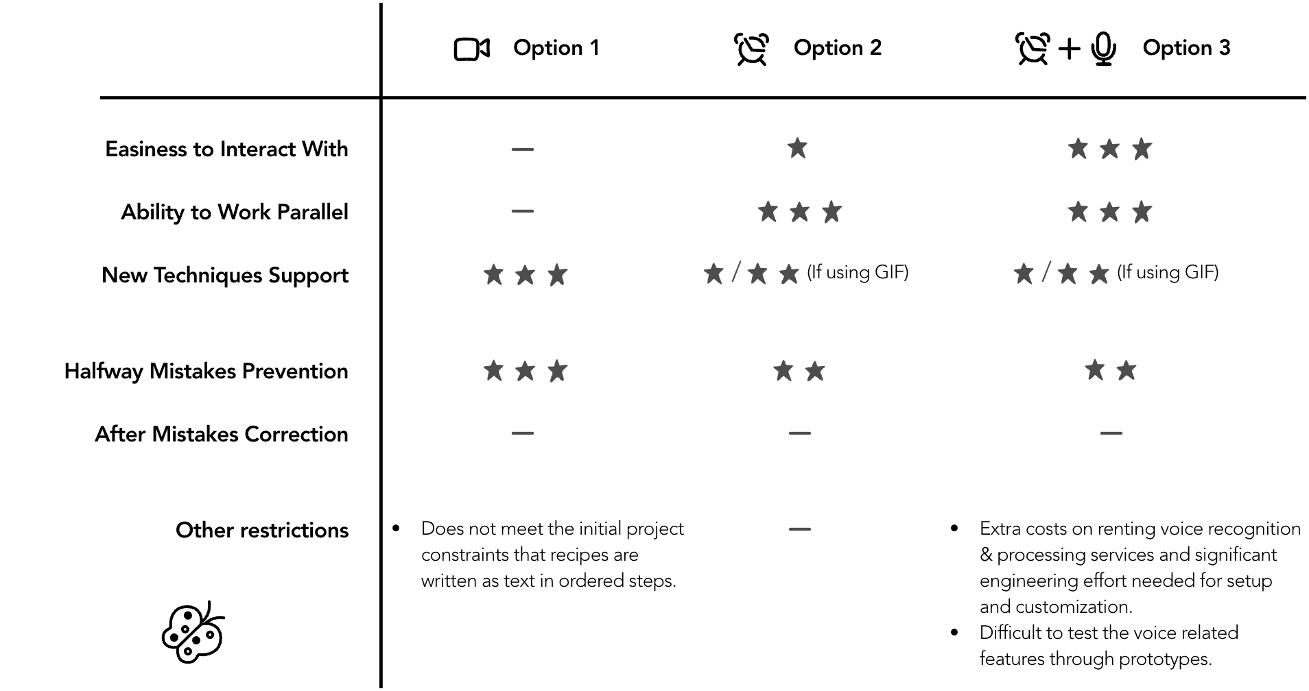

Making the Call: Why Option 2?

Storyboard
By the close of Day 3, I chose the Option 2 as the current best path. This decision set a clear direction for prototyping and testing—balancing problem-solving with practical execution. With the entire storyboard now mapped out, I was energized to translate this concept into a tangible, testable prototype on Day 4.
Day 3 of the GV Design Sprint is all about evaluating solutions critically, choosing the most promising direction, and going forward with it.
The sprint is great for testing risky solutions, so skip those easy wins in favor of big, bold bets.
——Jake Knapp, creator of the GV Design Sprint methodology

I’ll walk through some of the key design choices and elements that shaped the cooking instruction flow. These decisions all focus on tackling the pain points identified earlier in the sprint, and enhancing the ease of use during the cooking process.
If you’d like to interact with the prototype, scroll down to the link at the end of this section.
Feature 1: Dual CTA (Call-to-Action) Buttons
Problem: Users like Lindsey and Anthony both described that it’s frustrating to touch the screen with dirty or wet hands. While constantly washing hands to interact with disrupts the cooking flow and becomes a major inconvenience.
Solution: Since voice control wasn't a feasible option, I focused on simplifying the interaction to its core. My solutions?
Utilizing smartphone’s light sensor to move to the next step—by covering over the screen.
Introduced two large CTA buttons placed at the bottom of every step and dialog screen. These buttons:
Are large enough to be tapped with elbows, knuckles, or wrists. Without requiring clean fingers or precision.
Eliminate the need to scroll throughout the instruction flow.
Leverage strong color contrast for instant clarity: orange = main action, blue = flexible option.
Offer only the “must” actions.

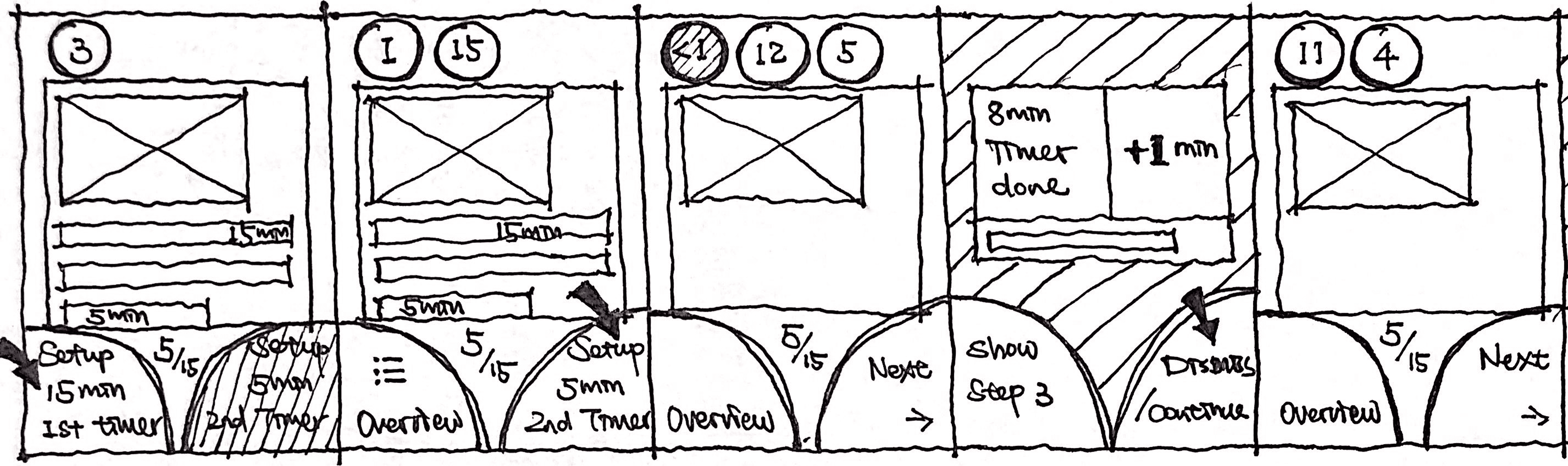
3
/ 12

Stir the mixture when boiling, cover the saucepan, and reduce the heat to low.
Cook the rice until the liquid is absorbed, 15-18 min.
Once done, remove from the heat and let it stands, still covered, for 5 min.
Setup
15 min
Timer
Next

9:41


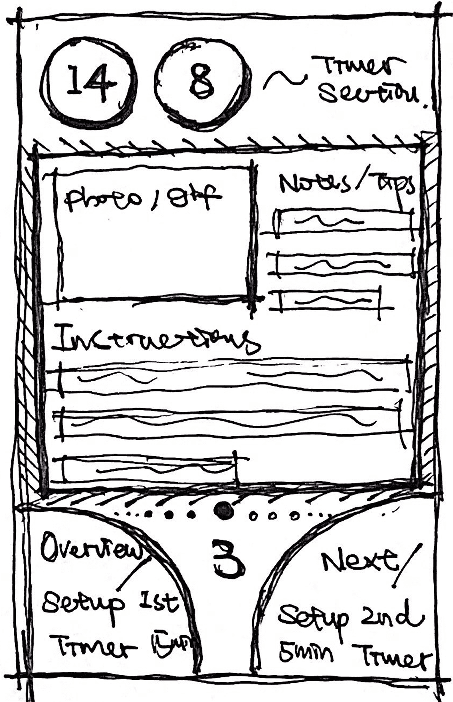
Feature 2: Parallel Workflow with Timers
Problem: Another major frustration was poor use of downtime in cooking. Users like Silvia and Dan both mentioned that they wanted to make better use of waiting periods—but the app didn’t provide the feature or structure to do so.
Solution: Inspired by the computer operating system concept of multi-threading, countdown timers were introduced.

Style Guide (Clarity Under Pressure)
I defined a simple style guide—high-contrast colors, legible fonts, and oversized touch targets. Designed to keep users focused on cooking while consistent with Savr’s brand.
For Typography
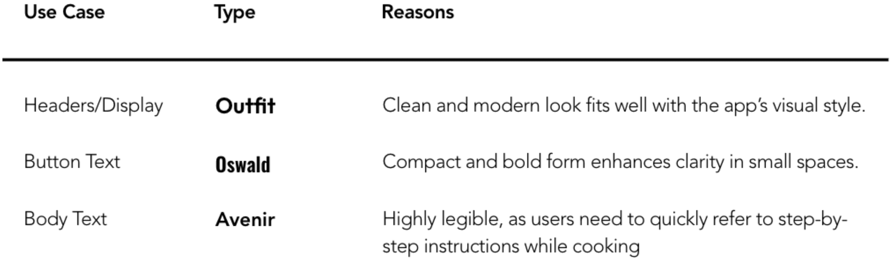
For Color Pallette
I maintained the app’s primary white and secondary orange (#FF8700),
A tertiary blue (#3393FF) was introduced, which is used only for one of the two CTA (Call-to-Action) buttons, leveraging contrast for clarity.
Instruction text is in black for readability.
Day 4 of the GV Design Sprint is where ideas become tangible. It’s the time to convert the winning storyboard into an interactive prototype, essential for conducting usability tests and validating the proposed solution.
There are some parts I don’t enjoy though... like, constantly needing to wash my hands so I can refer back to my phone.
——Lindsey, Savr user
12
/ 12

cup
Once the stack is complete, flip the measuring cup onto a large plate. Tap on the bottom of the cup to loosen the stack.
Serve immediately, 2-stacks per person. Enjoy!
5 min
2
:
26
+1 Min
Once done, remove the rice from the heat and let it stands, still covered, for 5 min.
Show
Step 3
Cancel
Timer
9:41
Impact: Why dual CTA buttons design works?
Product Usability Dimensions:
Utility: Features that solve real problems.
Learnability: How quickly users grasp the interface.
Memorability: Easy recall after breaks.
Efficiency: Minimal steps to complete tasks.
Error Prevention: Design that avoids mistakes.
Satisfaction: How enjoyable using the product.
It consolidates and streamlines all actions (Learnability, Memorability, and Efficiency), with current 8 different action combinations for varied scenarios, there is one consistent way to navigate.
It provides great engineering benefits (Stakeholder support).
Reducing cost: reusable component = faster builds.
Preventing errors: fewer customized code & one component to debug.
Boosting scalability and maintainability: future iterations can be easily added by modifying button functions or making new combinations without requiring new components or disrupting the base design.
I think it would be easier if the steps can be lay out like, you can do this while the meat is cooking.
——Silvia, Savr user
Sometimes I’ll be standing around waiting, and it’s not until later that I realize I could’ve saved 20 min by starting on something else.
——Dan, Savr user
Testable Prototype (Start Cooking!)
Within only one day, I put together this interactive prototype, which simulates the redesigned cooking instruction flow. It was used in the usability testing the next day to gather feedback and validate the design.
Click “START COOKING!” button below to play with the prototype.
Testing Setup
Outcome
Recipe page gave confidence upfront: Users appreciated the prep summary, instruction overview and visual clarity before jumping into the steps.
Timers reduced stress: The ability to “set it and forget it” while preparing the others saved time and helped create a calmer cooking experience. 3/4 of participants adopted this concept easily and liked it.
This is something I’d actually use in real life.
——Damei, test participant
I really like the design that there are 2 timers which tracking different tasks.
——Qingge, test participant

1
Using a strainer, rinse the rice under cold, running water, then drain and transfer to a small saucepan.
Add water and bring the mixture to a boil over high heat.
2
Wash and dry the fresh produce.
3
Stir the mixture when boiling, cover the saucepan, and reduce the heat to low.
Cook the rice until the liquid is absorbed, 15-18 min.
Once done, remove from the heat and let it stands, still covered, for 5 min.
4
Trim and discard the ends of the cucumber; halve the cucumber lengthwise, then cut in 1/2-inch cubes. Add to a bowl.
5
Cut the bell pepper into quarters lengthwise; remove the seeds and white membranes.
Small dice the pepper. Add to the bowl with the cucumber.
6
Season vegetables with soy sauce and sesame oil.
Add sesame seeds and stir to combine.
7
Halve and pit the avocado; cube the flesh into 1/2-cubes while still in the skin.
Scoop out the flesh and set aside.
8
Drain tuna, add to a new bowl, and flake with a fork.
Add water and boil over low heat for 3-5 min.
9
Wait until the rice are fully cooked.
Uncover the rice and fluff with a fork.
Add vinegar and salt and stir to combine.
10
Wait until the tuna are fully cooked.
Add chili-garlic sauce and mayo and stir to combine.
11
Using a 1 cup measure, fill up to the 1/3 mark with veggies and avocado, then to the 1/2 way mark with tuna, and finally the rest of the way with the rice.
12
Once the stack is complete, flip the measuring cup onto a large plate. Tap on the bottom of the cup to loosen the stack.
Serve immediately, 2-stacks per person. Enjoy!
9:41
Leave
Cooking
Mode
Continue
cooking
1
Using a strainer, rinse the rice under cold, running water, then drain and transfer to a small saucepan.
Add water and bring the mixture to a boil over high heat.
2
Wash and dry the fresh produce.
3
Stir the mixture when boiling, cover the saucepan, and reduce the heat to low.
Cook the rice until the liquid is absorbed, 15-18 min.
Once done, remove from the heat and let it stands, still covered, for 5 min.
4
Trim and discard the ends of the cucumber; halve the cucumber lengthwise, then cut in 1/2-inch cubes. Add to a bowl.
5
Cut the bell pepper into quarters lengthwise; remove the seeds and white membranes.
Small dice the pepper. Add to the bowl with the cucumber.
6
Season vegetables with soy sauce and sesame oil.
Add sesame seeds and stir to combine.
7
Halve and pit the avocado; cube the flesh into 1/2-cubes while still in the skin.
Scoop out the flesh and set aside.
8
Drain tuna, add to a new bowl, and flake with a fork.
Add water and boil over low heat for 3-5 min.
9
Wait until the rice are fully cooked.
Uncover the rice and fluff with a fork.
Add vinegar and salt and stir to combine.
10
Wait until the tuna are fully cooked.
Add chili-garlic sauce and mayo and stir to combine.
11
Using a 1 cup measure, fill up to the 1/3 mark with veggies and avocado, then to the 1/2 way mark with tuna, and finally the rest of the way with the rice.
12
Once the stack is complete, flip the measuring cup onto a large plate. Tap on the bottom of the cup to loosen the stack.
Serve immediately, 2-stacks per person. Enjoy!
Leave
Cooking
Mode
Continue
cooking
Overview page provided flexibility: 2/4 of participants liked the navigation provided by overview page. One strongly preferred scrollable interaction, emphasizing the need for flexibility and adaptability during cooking.
It’s easier and faster for me to scan through by scrolling up & down between steps.
——Damei, test participant
Sometimes I like to jump around depending on how the cooking’s going.
——Qingge, test participant
What Could Be Improved
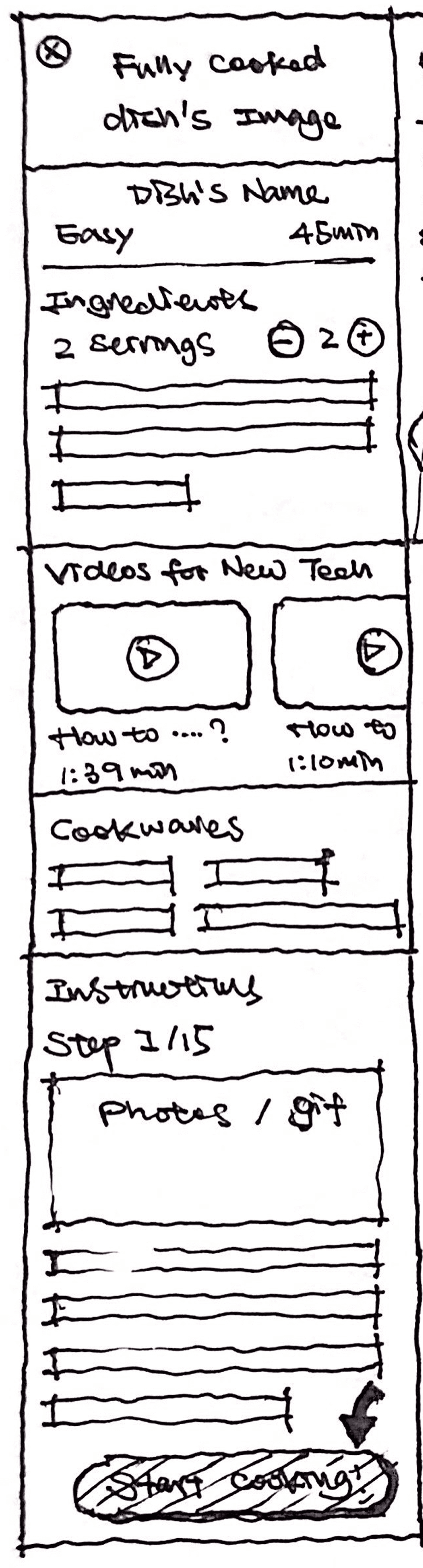
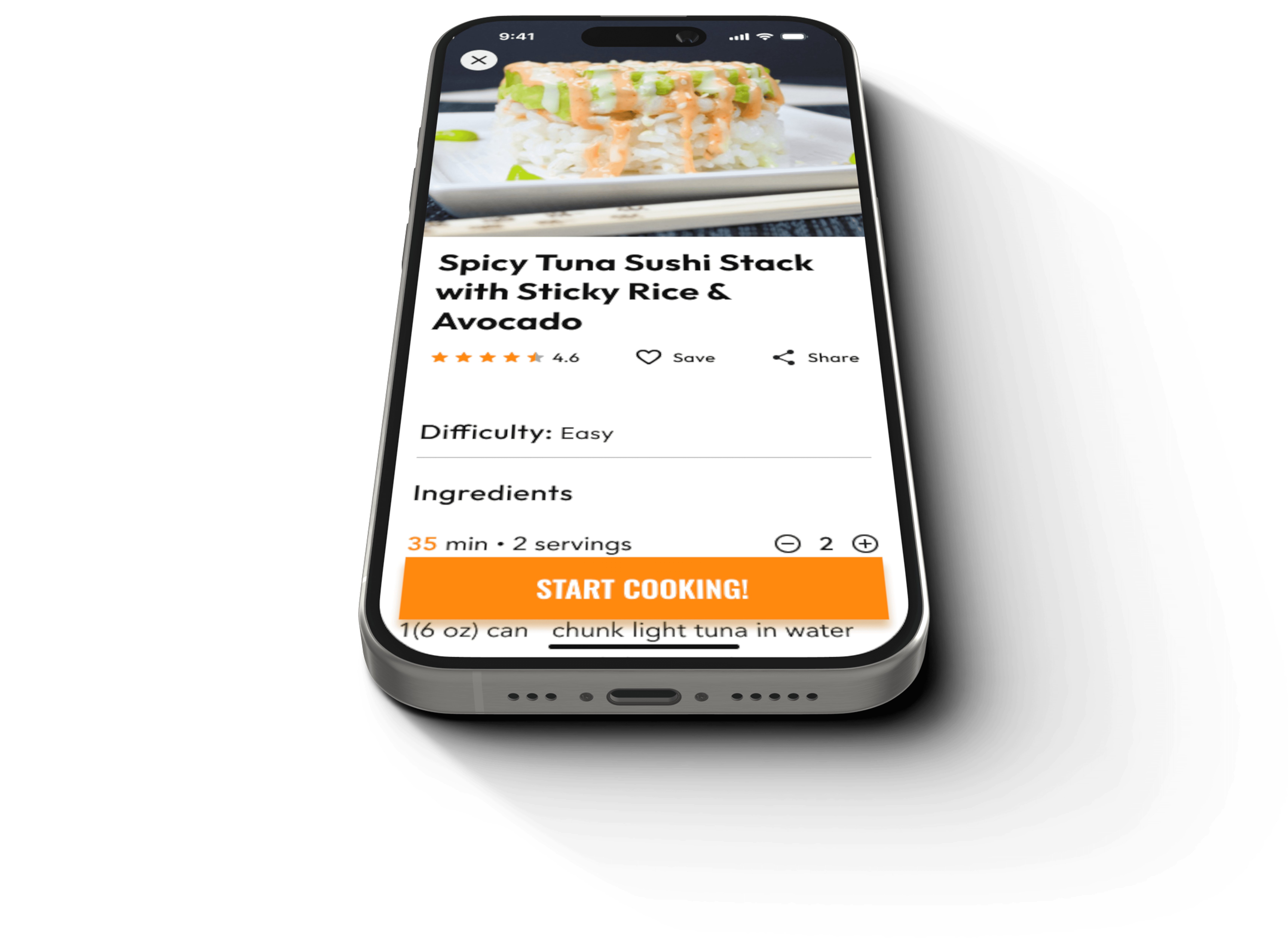
Spicy Tuna Sushi Stack with Sticky Rice & Avocado
4.6
Save
Share
Difficulty: Easy
Ingredients
35 min · 2 servings
2
1
avocado
1(6 oz) can
chunk light tuna in water
1/2
English cucumber
1 cup
jasmine rice
1/2
red bell pepper
1 tsp
chili-garlic sauce
2 tsp
mayonnaise
salt
1 tsp
rice vinegar
1 tsp
sesame seeds
1 tsp
soy sauce
1/2 tsp
toasted sesame oil
Cookware
chef’s knife
cutting board
mixing bowls
measuring cup
measuring spoons
small saucepan
stirring spoon
strainer or colander
baking sheet pan
Cooking Techniques Used

Homemade roasted red peppers
1:11 min

How to thicken a sauce
48 sec
Instructions

1
Using a strainer, rinse the rice under cold, running water, then drain and transfer to a small saucepan.
Add water and bring the mixture to a boil over high heat.

2
Wash and dry the fresh produce.
3
Stir the mixture when boiling, cover the saucepan, and reduce the heat to low.
Cook the rice until the liquid is absorbed, 15-18 min.
Once done, remove from the heat and let it stands, still covered, for 5 min.

4
Trim and discard the ends of the cucumber; halve the cucumber lengthwise, then cut in 1/2-inch cubes. Add to a bowl.

5
Cut the bell pepper into quarters lengthwise; remove the seeds and white membranes.
Small dice the pepper. Add to the bowl with the cucumber.

6
Season vegetables with soy sauce and sesame oil.
Add sesame seeds and stir to combine.

7
Halve and pit the avocado; cube the flesh into 1/2-cubes while still in the skin.
Scoop out the flesh and set aside.

8
Drain tuna, add to a new bowl, and flake with a fork.
Add water and boil over low heat for 3-5 min.

9
Wait until the rice are fully cooked.
Uncover the rice and fluff with a fork.
Add vinegar and salt and stir to combine.

10
Wait until the tuna are fully cooked.
Add chili-garlic sauce and mayo and stir to combine.

11
Using a 1 cup measure, fill up to the 1/3 mark with veggies and avocado, then to the 1/2 way mark with tuna, and finally the rest of the way with the rice.
12
Once the stack is complete, flip the measuring cup onto a large plate. Tap on the bottom of the cup to loosen the stack.
Serve immediately, 2-stacks per person. Enjoy!
Start cooking!
Texts should only be necessary or useful for the quantitative reference.
——Qingge, test participant
Videos or GIFs carry the message better. Texts should only support them.
——Qingge, test participant
I want to quickly dismiss the dialog. I need to refer back to the current task asap, I’m frying something.
——Effie, test participant
Why I cannot dismiss the dialog? Only way to dismiss is to click the bottom buttons? But I just want to back to the current page, cuz I’m halfway reading it.
——Cathrine, test participant

Oh I mistakenly closed the dialog, it seems it won’t remind me or show up again? I forget what it said.
——Qingge, test participant
Confusion with timer action: Some participants were a bit confused about the "Show Step X" button when the time-up dialog pops up and expected the dialogs to remind them of the timer's purpose.
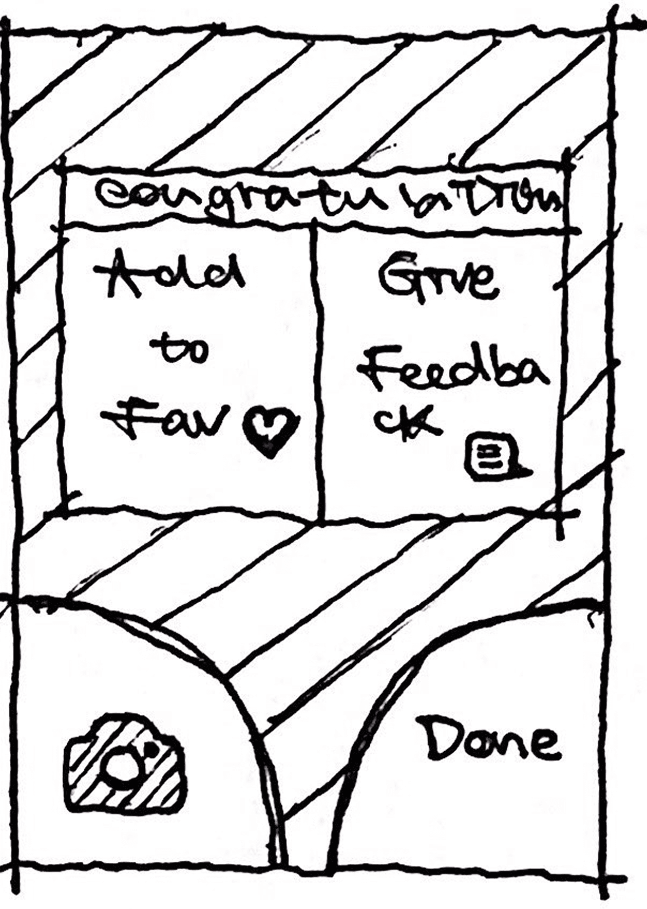
Feedback timing felt premature: 2/4 of participants noted that they wouldn’t want to give feedback immediately after cooking and preferred a simpler or later feedback mechanism.
12
/ 12
cup
Once the stack is complete, flip the measuring cup onto a large plate. Tap on the bottom of the cup to loosen the stack.
Serve immediately, 2-stacks per person. Enjoy!
Add to your favorites
Give feedback
Done
9:41
Unclear step interactivity: One participant initially thought the steps on the overview page weren’t clickable, which caused a moment of hesitation.
1
Using a strainer, rinse the rice under cold, running water, then drain and transfer to a small saucepan.
Add water and bring the mixture to a boil over high heat.
2
Wash and dry the fresh produce.
3
Stir the mixture when boiling, cover the saucepan, and reduce the heat to low.
Cook the rice until the liquid is absorbed, 15-18 min.
Once done, remove from the heat and let it stands, still covered, for 5 min.
4
Trim and discard the ends of the cucumber; halve the cucumber lengthwise, then cut in 1/2-inch cubes. Add to a bowl.
5
Cut the bell pepper into quarters lengthwise; remove the seeds and white membranes.
Small dice the pepper. Add to the bowl with the cucumber.
6
Season vegetables with soy sauce and sesame oil.
Add sesame seeds and stir to combine.
7
Halve and pit the avocado; cube the flesh into 1/2-cubes while still in the skin.
Scoop out the flesh and set aside.
8
Drain tuna, add to a new bowl, and flake with a fork.
Add water and boil over low heat for 3-5 min.
9
Wait until the rice are fully cooked.
Uncover the rice and fluff with a fork.
Add vinegar and salt and stir to combine.
10
Wait until the tuna are fully cooked.
Add chili-garlic sauce and mayo and stir to combine.
11
Using a 1 cup measure, fill up to the 1/3 mark with veggies and avocado, then to the 1/2 way mark with tuna, and finally the rest of the way with the rice.
12
Once the stack is complete, flip the measuring cup onto a large plate. Tap on the bottom of the cup to loosen the stack.
Serve immediately, 2-stacks per person. Enjoy!
9:41
Leave
Cooking
Mode
Continue
cooking
Day 5 of the GV Design Sprint is about validation. The goal wasn’t to test perfection—it was to observe reactions, uncover sticking points, and determine whether the solution held promise.
In just five days, I turned real user frustrations into a tested, interactive prototype that addressed key cooking challenges like multitasking, timing, ease of use. This sprint gave Savr a clear, validated direction for enhancing their app.
If I had more time —
next steps
Deeper Exploration of User Preferences
Begin by defining key success metrics, such as:
Time spent per step
Total recipe completion time
Error rate during cooking
Total number of interactions
Recommend Savr provide GIF-based step instructions and explore how it impacts the cooking experience.
Investigate one pain point that we didn’t cover in this sprint—How might we help users recover from mistakes mid-recipe?
Conduct field study, observing users cooking real meals with the app to validate the design in context and guide future roadmapping.
Insight —
Learnings
Adopting a New Design Process
A 5-day sprint showed me again the value of bold, rapid experimentation—it forced quick decision-making and prioritization.
Coming from the tech industry, where fast-paced execution is often the norm, I know this intense timeline actually mirrors the real-world demands of product development. Speed doesn’t necessarily compromise quality—rather, it pushes creativity and sharpens decision-making.
Flexibility During the Design
While frameworks like the design sprint, double-diamond, or Stanford design thinking process offer structured, linear approaches, they are abstractions of the process.
Real-world projects rarely follow such a neat, linear path. More often, it’s about selecting the right tools for the job, quickly testing ideas, and iterating as necessary. Stay flexible in the process is key. It’s crucial to master a broad toolkit of methodologies and remain agile in applying them. Depending on the context and goals, bending the ‘rules’ to get the best outcome, and that’s okay.
2024⼁Mobile⼁UI/UX design⼁By Hengqing