


What I’d Build for You,
I Built for Myself
—A Portfolio Site That Speaks UX
2025
Website
UI/UX design
By Hengqing
My Role
Designer
Duration
4 months
The Problem
Hiring managers today face information overload when evaluating designer portfolios. With limited time, they need to quickly understand a candidate’s design process, skills, and cultural fit—without unnecessary distractions or friction.
In my case, the challenge was even greater: I needed to explain why I pivoted from engineering to product design and convince hiring managers that I’m not just passionate about design, but fully capable of bringing unique strengths and real potential to the field.
So how could I design a portfolio that tells my story and showcases my skills—without overwhelming the audiences?
The Solution
I took as a real UX project—with the same design process, user-centered thinking, and structured approach. Three steps worth highlighting during this journey were:
Focused research
Psychology-driven layout decisions
Storytelling to bring my own experience to life
The Result
A portfolio that highlights not just what I’ve done, but how I think, what I care about, and why I made the leap into the design.
The Learning
Quantity Informs Quality: I thought I had already seen good enough of portfolio sites, but looking at just a few more always gave me a fresh perspective. Analyzed 30+ portfolios, I saw common threads in successful portfolios and spotted pitfalls to avoid. I enjoyed being curious and absorbing outward, which is, in return, as valuable as refining things internally.
System Over Spontaneity: Before having enough empirical data, cognitive psychology became my compass. By breaking down the user thinking process into stages (Filter → Interpret → Act → Store), and applying targeted principles, I turned the process to a systematic, principle-driven approach, made purposeful and objective design decisions.
I applied psychology frameworks to guide my design decisions, including Dr. B.J. Fogg's Behavior Model (Motivation x Ability x Prompt) and Buster Benson’s Cognitive Bias (Wikimedia).

Focused Research: Learning What Matters
I took a “just enough” research approach. Three methods were selected to quickly understand the expectations and frustrations of the primary audience: hiring managers.
Secondary Research
I started by reviewing portfolio guides and best-practice articles from trusted resources.
User Interviews + Competitors Usability Testing
I then conducted three semi-structured interviews with experienced design hiring managers and mentors. Instead of just asking questions, I also asked them to perform live usability testing on other designers' portfolio sites and “Think out loud” through reviewing.
This gave me a first-hand, immersive view of their thought process—what confused them and what caught their attention.
Competitive Analysis
After analyzed 30+ product designers’ portfolio sites mimicking the real-world context of a hiring manager: limited time, background noise, and casual browsing conditions, I documented standout features, pain points, and usability issues.
The goal wasn’t to mimic what others were doing, but to identify repeatable success patterns and avoid common traps. (See my analysis board)

Some screenshots when I conducted the user interview + competitors usability testing.
Quick Synthesis: Connecting the Dots
To better summarize the insights from the research, I created a target user persona: Nick.
Legibility is always the 1st to consider.
A strong candidate removes distractions and makes their value obvious.
Nick’s Frustrations
Time Constraints: Must evaluate portfolios in minutes; hates clutter or unnecessary flourishes that obscures key info.
Info Overload: Struggles with unstructured case studies or distracting elements.
Missing Process: Needs to see how decisions were made, not just final screens.
Responsiveness Red Flags: Broken layouts immediately damage credibility.
What Nick Wants (User Stories)
As a hiring manager, I want to quickly assess your design process and problem-solving skills.
I want to gauge your communication ability through how you articulate design decisions and storytelling.
I want to verify you practice what you preach (usability, accessibility, responsiveness, attention to detail).
(If time allows) I want to sense cultural fit through personality/passion hints.
USER PERSONA
Nick Bennett
39 / Male
AGE
39
Occupation
Hiring Manager
STATUS
Single
LOCATION
Los Angeles

Sitemap: Mapping Content & Hierarchy
I began by designing all content and creating a sitemap—a blueprint defining the site’s information structure and relationships between pages. This early system-level thinking not only streamlined the design work later on but also aligned with how I’d approach any user-centered product.
Project highlights
Project highlights
Project highlights
Project highlights
Project highlights
Project highlights
Story about this journey
Story about this journey
Story about this journey
Story about this journey
Story about this journey
Story about this journey
Story about this journey
Story about this journey
Story about this journey
Product design intern
Quick intro
Product design intern
Quick intro
Growth Engineer & Android SWE
Quick intro
Android SWE
Quick intro
Growth Engineer & Android SWE
Quick intro
Web Full-stack Software Engineer (SWE)
Quick intro
UI & Web Development Intern
Quick intro
Embedded System Engineer
Quick intro
Data Analyst Intern
Quick intro
Quick intro
Quick intro
Quick intro
Quick intro
Quick intro
Quick intro
Quick intro
Quick intro
Quick intro
Quick intro
Work
Case Study
About
Fun
Contact
Hero Section
Selected Work
Footer
Content
Catalog
Footer
Hero Section
Image Section
Experience Section
Personal Story Section
Footer
Hero Section
Motion Graphic
& Video Product
Illustration
Graphic Design
Photography
Footer
Link to Footer
Logo + Full Name
Hero Message: A product designer fueled by a love for visual strategies and humanity, crafting user-centered experiences that solve problems and drive impact.
Formerly a Senior Software Engineer at Meta (2018-2023).From engineer to designer, learn about my journey.
Srsti.art - An artist-first AI platform
Budget Buddy – A Fun & Simple Budgeting App for Gen Z
The Battle Against Forgotten Subscriptions
How to help Savr recipe app users cook with ease
A Portfolio Site That Speaks UX
Craigslist Homepage Redesign
Customized Contact Message
(Don’t Be A Stranger)
Projects List
2025 Hengqing Wang, New York City
Follow this case study’s inner structure
Logo + Name
Title of the Project
Case Study Section Titles
Next Case Study Link
Contact Hengqing
(Same as Above)
Name
Hero Message: I once solved problems with code. Now I do it with design.
Transition Message
Quick Intro of the Image
Srsti.art AI
ShopLitLive, Inc
Meta Platforms, Inc. CAA (Company Account Access) Identification
Meta Platforms, Inc. CAA AYMH (Accounts You May Have)
Facebook, Inc. Messenger Access
Facebook, Inc. Oculus/Quest & Portal E-commerce (Now Meta Store)
mProbe, Inc
NXP (FKA Freescale Semiconductor) Autonomous Car Cup
Stanford Medical School Translational Medicine Lab
Early Career Path
Valuable Experiences at Facebook
Design Rediscovered
So Who Am I
Commitment to Design
Current Endeavors
Outside of Work
Closing Thoughts
Thanks Notes
(Same as Above)
Hero Message: I don’t just love visuals, I chase them
Overview
Coconut Woman
Budget Buddy App Explainer Video
Overview
The Impression of PNW
Fleeting Life, Endless Journey
Pen & Watercolor Illustration Series
Overview
BurgerMania Logo Redesign
Poster Design
Phat Rooster Studio Logo Design
Map Illustration of China
My Personal Logo Design
Overview
Photos Gallery
(Same as Above)
Hengqing’s Portfolio Site

Psychology-Driven Layouts: A Divide-and-Conquer Approach
Breaking Down Cognitive Interactions
When empirical data (tests observations or experiment results) was limited, my engineering mindset still led me to a scientific approach—Just as I would break down a complex system into small & solvable components, I split the user’s System 1 thinking into four cognitive stages (Filter → Interpret → Act → Store) and applied science-backed principles (psychology, UX heuristics, and visual principles) at each to guide layout decisions.
This method enabled a design process that was more strategic, empathetic, and grounded in objective reasoning—meeting users where they are, nudging them forward, and leaving a lasting impression.
FILTER
Brain instinctively filters out information.
I need to make sure the key contents won’t be ignored by users.
INTERPRET
Users try to understand what’s happening.
How to help them understand quickly and effortlessly?
STORE
This involves how users mentally retain their experience with my portfolio site.
SYSTEM 1 THINKING
Fast, automatic, subconscious decision-making
ACT
The next step could be to encourage users to take action.
Whether it’s clicking a button, exploring a case study, or reach out to contact.
How to facilitate a user behavior or action?
Applying Principles on Wireframes
Based on the sitemap structure, my portfolio site centers around four main pages: the Homepage, Case Study Page, About Page, and Fun Page. This part showcases how abstract principles guided concrete layout decisions for each page.
HOMEPAGE
Homepage Option 1
work
About
Fun
Contact
Hengqing Wang
A product designer fueled by a love for visual strategies and humanity, crafting user-centered experiences that solve problems and drive impact.
Formerly a Senior Software Engineer at Meta (2018-2023). From engineering to design, learn about my journey.
Selected Work (10)
Pick One for Me
All
Website
Mobile
Explainer Video
Data-driven
Psychological Analysis
Design Sprint
Research
Srsti.art - An artist-first AI platform
The Battle Against Forgotten Subscriptions
website, Team-driven, layout discussions
mobile, research, test & iterations
Lorem ipsum dolor sit amet consectetur. Laoreet eget sed convallis aenean quis arcu praesent urna a. Sem pharetra egestas sem cras.
Lorem ipsum dolor sit amet consectetur. Laoreet eget sed convallis aenean quis arcu praesent urna a. Sem pharetra egestas sem cras.
Don’t be a stranger
Projects
Company account access
Messenger SSO auto login
Srsti.art
Subscription management app
Savr recipe app
Budget Buddy app
GourmetGo app
Portfolio site redesign
Craigslist homepage redesign
Test & Iteration
Learnings & Take away
Sketch
Storyboard
Layout Discussion
Information Architecture
2
3
4
6
7
8
1
3
5
6
5
6
4
3
2
1
Homepage Option 2
work
About
Fun
Contact
Hengqing Wang
A Product Designer fueled by an enduring love for visual strategies, humanity and complex problem-solving.
Crafting user-centered digital experiences that pursue business goals and drive impacts.
Formerly a Senior Software Engineer at Meta (2018-2023). Curious about my journey from engineering to design?
Check out About page for the full story.
Selected Work (6)
Pick One for Me
Don’t be a stranger
Projects
Company account access
Messenger SSO auto login
Srsti.art
Subscription management app
Savr recipe app
Budget Buddy app
GourmetGo app
Portfolio site redesign
Craigslist homepage redesign
Srsti.art - An artist-first AI platform
Help Savr recipe app users cook with ease
The Battle Against Forgotten Subscriptions
website, Team-driven, layout discussions
mobile, design sprint, sketch & storyboard
mobile, research, test & iterations
View Full Version Case Study
View Explainer Video
View Presentation Slides
View Short Version Case Study
View Case Study
View Case Study
Lorem ipsum dolor sit amet consectetur. Laoreet eget sed convallis aenean quis arcu praesent.
Lorem ipsum dolor sit amet consectetur. Laoreet eget sed convallis aenean quis arcu praesent.
Lorem ipsum dolor sit amet consectetur. Laoreet eget sed convallis aenean quis arcu praesent.
2
1
3
9
1
5
2
4
Homepage notation list
Filter
Interpret
Act
Store
1
[High-Effort Consumption]: The quick intro on the old version homepage was too lengthy, with inconsistent indentations and varying sizes and colors. These elements consume users’ psych to process and could lead to them skimming or ignoring most of it. Simplified to this one sentence.
2
The watermark personal logo as the hero image seems Irrelevance. Doesn’t add much value in showcasing my skills as a UIUX designer. But it does can add some fun to the page and balance the visual weight. Keep it.
3
[Redundant]: Remove “Home” option in the top navigation bar. “Work” option can act the same.
4
[High-Effort Consumption]: The case study overview on the old version is still too lengthy, users are more likely to filter it out. Keep it short or remove it.
5
[Redundant]: Highlights sections focus on listing the critical contents of each case study. But it can be redundant with the filter function. Be cautious.
6
[Pattern Interruption]: The zig-zag shape at the footer is a good touch. It breaks patterns, pulling focus. So keep it. But think about what to put inside the footer if it brings people’s attention.
1
[Social Proof—Certifications]: In the homepage intro, highlights “Senior engineer at Meta from 2018 - 2023” to immediately establish credibility (When organizations endorse a product or person).
2
[Benefits]: Clearly articulate the values I can bring in the quick intro. Focus on communicating my unique value as a designer.
3
[Curiosity Gap + Answer Questions Before They Arise]: Anticipate a question “Why pivoting to UIUX design?” direct the users to the About page. Keep users intrigued and explore more pages of my site.
4
[Benefits]: Frame case study titles around benefits or loss aversion to immediately highlight the value delivered.
5
[Discoverability]: Make the work section bold and visually distinct. Consider using font or strong visual elements to draw attention, and indicate it’s the most important contents on the homepage.
6
Introduce GIF, motion or brief video previews that play when hovering over case studies to enhance engagement and provide more info for users to consume but cost them low-efforts. (Low Priority)
1
[Curiosity Gap]: Include a subtle hook about “Why pivoting?” in the quick intro on Homepage and direct users to the Bio page for details. Leverage the curiosity gap to encourage exploration across the site.
2
[Curiosity Gap]: In filter options, contain some intriguing categories like "Explainer Video," "Psychology Analysis," or "Google Venture Design Sprint." Use some relevant but unconventional options to stir curiosity and interest.
3
[Hick’s Law + Miller’s Law]: Presenting too many case study choices could overwhelm users and result in decision paralysis, making it harder for them to take action. Considering that I have at least 7+ case studies, introducing the filter to dynamically narrow down options, making it easier for users to make a decision.
4
[Multiple Classification Principle (IA) + Cut Down Options (Hick’s Law) + The Principle of Growth (IA)]: I assume the content I have today is a small fraction of the content I will have tomorrow. Add a filtering feature that allows users to quickly find case studies they want to explore based on topics, techniques or the design process. Ensure the filter covers the entire design workflow.
5
[Decrease the DPP (Decision Per Page, Miller’s Law)]: Decrease the DDP, include actions (which always require a decision) and information that leads to a decision. Only introducing the filter when necessary and hide the filter inside an accordion, only show up when you needed and clicked.
6
[Valid Default]: Adding a “Pick One for Me” or “Check the Recent Work” button that opens the best case study to read. This acts as a valid default option for users who prefer quick decisions.
7
[Curiosity Gap]: Use curiosity-driven hooks in case study titles to draw users in and make them eager to learn more.
8
Place a contact section at the bottom of every page with tailored messages based on each page’s context to encourage audiences to contact or connect with me.
9
Provide email templates for various purposes (e.g., collaboration, inquiries) with one-click send functionality. Or include an option for users to input their email so I can follow up. (Low Priority)
1
[Incorporate Empathy]: Offer users “Save Time and Read Short Version” or/and “Watch Explainer Video” options for case studies, acknowledging their time constraints while ensuring they get the essential insights.
2
[Delighter]: After users engage with the portfolio’s core content, provide an option to watch a lighthearted “Coconut Woman” fun video to leave a positive and memorable impression?
3
[Consistency]: The similar two side-by-side panels layout & interaction way between homepage and case study pages strengthens memory encoding, which make both navigation and content recall more intuitive.
CASE STUDY PAGE
Love to hear from
you!
Projects
Company account access
Messenger SSO auto login
Srsti.art
Subscription management app
Savr recipe app
Budget Buddy app
GourmetGo app
Portfolio site redesign
Craigslist homepage redesign
Lorem ipsum dolor sit amet consectetur. Scelerisque mi eget quis amet sed in sit ut consectetur. Pellentesque neque et elit nisl eget egestas sed duis. Lacus id nunc tellus pellentesque fermentum semper suspendisse nibh venenatis. Quis ullamcorper tristique nibh mattis. Nibh eget dignissim dolor ullamcorper enim hendrerit.
Prev: Help Savr recipe app users cook with ease
Next: The Battle Against Forgotten Subscriptions
Hengqing Wang
Srsti.art
- An artist-first AI platform
Overview
Research
Synthesis
Ideation
Wireframe
Style Guide
High-fi
Test & Iteration
Learnings
1
3
2
4
5
1
2
1
2
3
Interpret
Act
Store
1
[Reduce Cognitive Load]: Reducing the noise around the critical info by removing distractions like the top navigation menu and other non-essential elements to keep users focused on the case study contents.
2
[Discoverability]: Move the learnings and key takeaways to the start of the case study. Or presenting a concise version of these insights in the overview to make them immediately accessible, because they are the highlights I’d like to emphasize in each of my case study.
3
[Clear Structure and Key Points]: Ensure each case study has a well-defined structure with key takeaways prominently highlighted. This helps readers quickly grasp the most important information.
4
[Smooth Transitions]: Provide seamless transitions between different sections within a case study to avoid jarring shifts. Let audiences easy to follow or even jump between to scan.
5
[First-Second Magic + Pattern Interruption + Aesthetic-Usability Effect]: Use varied formats & strategic surprises to break the existing patterns to keep audiences interested and energized:
Project-Specific Visual Styles: Each case study adopts its project's unique aesthetic rather than conforming to the portfolio's base style, creating refreshing visual diversity while maintaining usability.
Explainer Videos: Embedded videos format to boost the engagement and understanding.
Storytelling & Storyboards: Structured case studies as compelling journeys (problem → insight → solution) using sequential visuals.
Unexpected Analysis Lenses: Introduce targeted analyzing approaches like psychological principles decision making, IA principles, data-driven, etc, to showcase multidimensional thinking.
Interactive Prototypes and Motions: Allow readers to experience the design process through dynamic, hands-on interactions.
Bold Visuals: Add striking design elements or bold typography to capture attention and create a memorable impression.
1
[Familiarity + Split Steps]: Include a sticky catalog pattern to provide an overview and display the case study’s steps/parts. This helps users both interpret and take action to jump between parts more effectively, especially for the super long case study.
2
[Reduce Steps (Reduce Friction)]: Add “Previous” and “Next” buttons at the end of each case study, allowing users to move between projects without returning to the Homepage. This can reduce one navigation step.
1
[Peak-End Rule]: Even the learning & insights section is placed at the end. Use this space to recap the project, summarize key takeaways, and connect insights to broader mindsets, elevating the value of the content. End at a high pitch.
2
Think about what interactive elements for the logo and name section on the case study page—when users hover, display additional actions like contact details, a link to the bio, or a shortcut back to the homepage. (Low Priority)
3
[Engaging Chronoception]: Leverage users' subjective perception of time by incorporating videos, GIFs, storyboards, or interactive elements to maintain engagement and make the browsing experience feel seamless and immersive.
case study page notation list
Don’t be a stranger
Projects
Company account access
Messenger SSO auto login
Srsti.art
Subscription management app
Savr recipe app
Budget Buddy app
GourmetGo app
Portfolio site redesign
Craigslist homepage redesign
work
About
Fun
Contact
Hi, I’m Hengqing,
Experience
Early Career Path
Closing Thoughts
From my early days as a child captivated by the power of visuals and immersed in drawing, my journey has been anything but conventional.
I once solved problems with code. Now I do it with design.
Stanford Medical School Translational Medicine Lab
NXP Autonomous Car Cup
mProbe Inc.
Oculus/Quest & Portal E-commerce (Now Meta Store)
Messenger Access
Company Account Access—CAA AYMH (Account You May Have)
CAA Identification
Srsti.art AI
Data Analyst Intern
Embedded System Engineer
UI & Web Development Intern
Web Full-stack Software Engineer (SWE)
Growth Engineer & Android SWE
Android SWE
Growth Engineer & Android SWE
Product Design Intern
Early Career Path
Valuable Experiences at FB
Design, Rediscovered
So Who Am I
Commitment to Design
Current Endeavors
Outside of Work
Closing Thoughts
Thanks Notes
With degrees in both Electrical Engineering and Computer Science, I initially approached the world through lines of code and complex problem-solving.
At Facebook, I made significant contributions to projects that boosted app access & usage by over 900,000 monthly users and was involved in developing the Meta brand identity, including integrating flows across Facebook, Messenger, and Instagram.
These years were transformative, driving tech innovations and navigating roles from Product Generalist to Growth Engineer enriched my abilities in rapid learning, project driving, tackling large-scale technical challenges, team collaboration, and so on.
Yet, despite excelling as an engineer, a growing sense of unrest and disconnect nagged at me. I started building my own Android app in my spare time.
I’m a problem solver dedicated to clear logic, thoughtful reasoning, and intuitive structure.
A guy deeply fascinated with humanity, influenced by my experiences living in diverse cultural settings across China & the U.S, and strengthened by my self-studies in history, geography, and psychology.
I’m a big visual person! Always fuel my enthusiasm for all forms of visual strategies. And driven by a lifelong commitment to “making things look better”.
Immersing myself in design brought a kind of joy and excitement I had never felt before—an energy that fuels me to keep learning, creating, and pushing forward. No matter what lies ahead, I know I won’t look back.
Now, I am advancing my expertise by pursuing a Master’s degree in digital & multimedia design, and tackling real-world challenges that sharpen my ability to create intuitive and effective solutions.
Explore my case studies to see how I apply the skills.
When I’m not designing, drawing, or animating, you’ll likely find me swimming—a decade-long passion I continue to refine—or exploring vistas through my camera, capturing hidden visual stories of the world. Check my photographs.
Reaching this point in my journey, I’ve learned that beyond any accolades or milestones, what matters most is the continuous exploration of self—awakening passions, embracing growth, and forging an authentic life that truly reflects who we are.
This realization guided me toward product design—a space where I could blend years of industry experience with a lifelong passion for solving human problems through visual strategy.
Current Endeavors
Commitment to Design
So Who Am I
In the process, I was touched by the power of design and struck by the fact that the excitement I felt designing far outweighed writing the code itself.
This led me to rediscover my core values and passions, reshaping how I see myself and my purpose.
Design, Rediscovered
Valuable Experiences at Facebook
Outside of Work
Abhishek Kumar, Bruce Ling, Gabriel Berard, Nakisa Mohammadifard, Shuo Li, Terry Fu, Williams Praise
To the mentors who helped me grow, Thank you!
1
3
2
4
1
2
1
3
5
3
4
3
2
1
2
ABOUT PAGE
Filter
Interpret
Act
Store
1
[High-Effort Consumption]: The old version’s About page is too text-heavy which feels overwhelming. Users are unlikely to read through everything. Simplify the content or format to make it more approachable.
2
[Provide a Clear Narrative]: The Bio lacks a clear storyline, which can make it feel unrelated or disjointed. Focus on answering key questions like: Why am I pivoting to UI/UX design? What unique advantages do I bring to the table?
3
[Unrelated]: For the imagery of the Bio section, the previous evolving rooster logo may be amusing, but the underlying connection with the content may not be clear to the audiences. Consider replacing it with something more meaningful and relevant.
4
[Confirming Our Beliefs]: People are naturally drawn to like-minded ideas. Highlight some of my personal and career growth beliefs to resonate with visitors and evoke an emotional connection.
1
[Familiarity + Visual Anchoring]: Use a timeline or progressive bar to guide users through the Bio content in an intuitive and familiar way. This can anchor their interaction and progressively disclose my experience in a easier digestible format. Consider presenting my journey in reverse chronological order, starting with the most recent achievements.
2
[Benefits]: Highlight what sets I apart and explicitly state the value I can bring. For example, emphasize my ability to communicate seamlessly with engineers using their vocabulary, and my insight into engineering mindsets and problem-solving approaches.
3
[Dual Coding Theory + Chunking]: Incorporate more visual elements like icons, infographics, or illustrations to break up the text and make the content more intriguing to understand at a glance.
4
[Storytelling]: Reorganize the content into a narrative format. Tell the story of my growth, career pivot, weaving in the challenges, insights, and unique strengths that have shaped me as a designer. This will make the content more engaging to users.
5
[Skimmable Content]: Format text to support scanning:
Use Headings
Use Chunking
Keep Clear Hierarchy
Keep Paragraphs Short
Use Bulleted Lists or Number Lists
Highlight Key Terms
1
[Social Proof]: Consider including LinkedIn recommendations or any testimonials on the About page to reinforce credibility and showcase professional endorsements.
2
If the About page covers too many topics (e.g., "Why Pivoting," "Experience," "Core Values," "Beliefs," and "Advantages"), a lightweight catalog or menu can help audiences quickly navigate to the sections they’re most interested in or question about.
3
[Visual Hierarchy]: Reduce distractions by removing unnecessary clutter between the user and their goal. Use enlarged text, bold fonts, color accents, and ample negative space to make key words or sentences stand out. This approach ensures that important information is easy to spot, users can scan the page and still get the most.
1
[Name-Repetition Effect (a.k.a. Spaced Retrieval)]: Same as the Case Study page, always remind my name in the About page.
2
Provide a concise version of my resume for download directly on the About page? This can complement the version submitted during the application process and offer easy access for users.
3
[Incorporate Empathy]: Customize the About page contact section or footer texts with meaningful messages that reflect human’s universal values and pursuits. For example: “The only true success is knowing yourself, being yourself, and creating a life that’s uniquely yours.”
ABOUT PAGE notation list
FUN PAGE
Love to share more!
Drop me a message
Projects
Company account access
Messenger SSO auto login
Srsti.art
Subscription management app
Savr recipe app
Budget Buddy app
GourmetGo app
Portfolio site redesign
Craigslist homepage redesign
work
About
Fun
Contact
I don’t just LOVE visuals
— I CHASE them
Illustrations
Graphic Design
Motion Graphic & Video Product
Photography
3
1
2
1
Act
Store
1
[Curiosity Gap]: Introduce a hover interaction and reveal a short story behind each piece of work, encouraging users to explore further. Once they discover this interaction, they are likely to hover over more to uncover stories, making the experience engaging and even feeling that they have some personal connecting with me.
1
[End on a High Note]: Encourage users to conclude their interaction on a positive note by linking the About page to the Fun page. Aim to end their journey with something light-hearted and enjoyable.
2
[Delighter with Visuals]: Incorporate more icons, illustrations, animations, or micro-interactions on the Fun page (For this is one of the purposes of this page) to create an engaging and delightful experience that leaves a lasting impression.
3
[Delighter]: If users have explored all the case studies and the About page, use a subtle micro-interaction, like a glowing or pulsing dot on the Fun tag in the top navigation bar, to entice them to click into the Fun page? (Low Priority)
FUN page notation list
Style Tile: Designing with Clarity and Intent
Before the high-fidelity design, I defined core style attributes to guide the visual decisions:
Clear: Prioritizing straightforward and easily digestible content.
Minimalistic: Clean design that avoids unnecessary embellishments.
Professional: Presenting a professional image to hiring managers.
Accessible: Designed with inclusivity in mind.
Organized: Ensuring logical and intuitive navigation for quick evaluation.
Engaging: Encouraging exploration and curiosity.
Colors
Light
Dark
Supports dual modes to ensure greater inclusivity and enhance accessibility.
for highlights & footer message.
Phudu
for image captions & teaser.
Nanum Pen Script
for decorations.
Vujahday Script
Rawest
for titles.
for content.
Oufit
Typography
iconography

Hello World
Selected, customized, and created icons to serve clear purposes, enhance context, and align with the overall clean and professional tone.
imagery


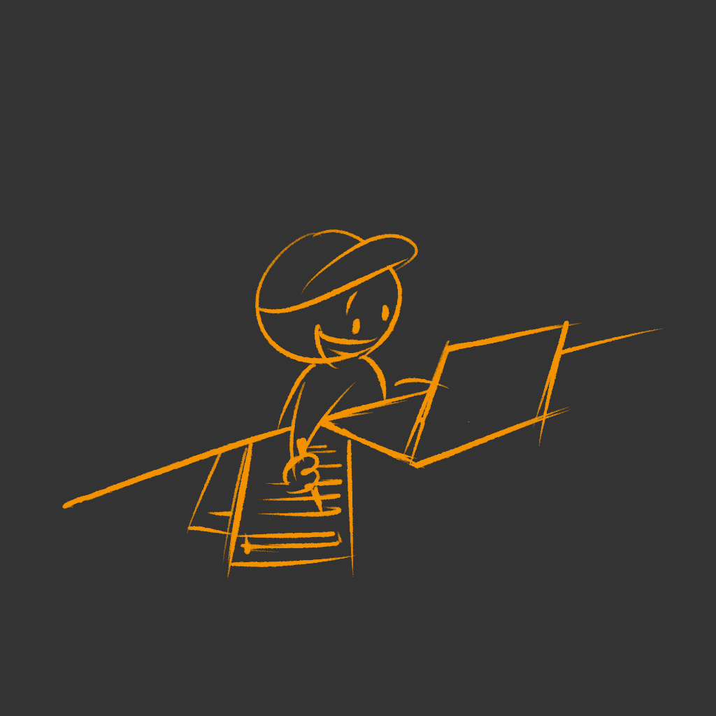
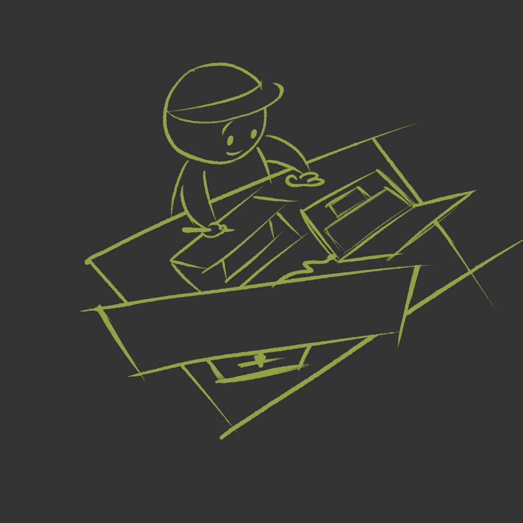
Hand-drawn 4 small illustrations to enhance storytelling in the About page—adding visual interest, and a touch of playfulness to engage viewers.
Selected personal snapshots to show the real me—adding authenticity, and a human touch that invites connection.
Hi-Fi & Prototype: You’re Already Living It!
This very portfolio site is the final product—So go ahead, poke around, experience any ‘feature’ I’d otherwise boast about here lol.
Edge Case? I’m on It.
This site is fully responsive across mobile, tablet, and desktop devices, with one exception—Case Study pages are best viewed on screens ≥1024px to ensure optimal reading and interaction.
From past experience, I know that most issues don’t occur in the main flow, but in the overlooked edge cases.
So I designed this dedicated page to handle it →.
Mobile view under construction!

Behind every pixel was a decision.
What could we solve together?
2025
Website
UI/UX design
By Hengqing
Projects
Projects
Mobile view under construction!