2024 ・ Mobile ・ UI/UX design
A Design Journey with Subly
My Role
Designer
Duration
3.5 weeks
Collaborator
Gabriel Berard (Design mentor)
Research & Design Methods
Secondary research, user interview, persona, competitor research, user flows, wireframe, high-fidelity mockups, prototype, and usability testing
The Problem
42% of users unknowingly pay for forgotten subscriptions, while companies profit from this chaos—forgetfulness boosts their revenues up to 200%. (See resources)
The Mission
As the solo designer for Subly, I took on this challenge: How might we help users like John (needs automation) and Lena (wants privacy) conquer subscription chaos? (See personas)
The Twist
Initial usability tests revealed polarizing reactions and shattered many original design decisions:
Colorful UI split users ("Fun!" vs. "Overwhelming!")
Floating action button (FAB) went unnoticed
8 key iterations applied, from killing the FAB to one-click notifications. (See details)
The Impact
Post-iterations, the same test tasks saw:
~30% faster tasks completion
100% success rate for critical flows (vs. 87.5% initially)
Zero confusion on subscription types
My Learnings
The importance of continuous test and observation
Rooting design decisions in objectivity (Read more)

A Growing Challenge
From the secondary research, users’ struggles with managing subscriptions are not only significant but also poised to become increasingly severe and challenging.
200%+
revenue boost for companies banking on user forgetfulness (According to economists at Stanford and Texas A&M.)
Netflix: 17.99
Forgotten charges: 480
The Project Mandate
The challenge wasn’t just to solve user pain points—it was to do so while have:
Business Asks
Grow the User Base
Expand to German Market: So ensure the app supports Germany seamlessly and consider any local preferences or regulations.
Maintain the Brand: Stay friendly and trustworthy.
Product Asks
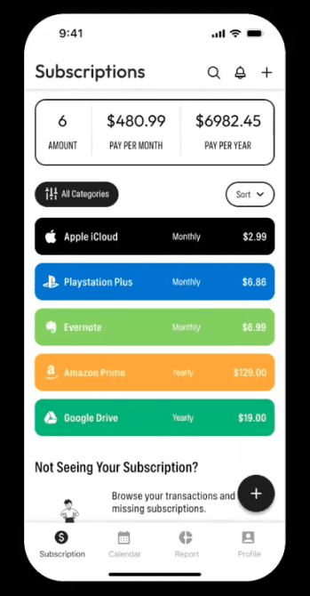
Provide Comprehensive Subscription View: Users need to have a holistic view of their spending.
Enable Easy Unsubscribing
Alert the User Before Renewals
Users Struggle with Clashing Needs
While stats revealed how many users struggled, interviews uncovered why. I spoke to 4 users with a diverse background from both the US and Germany to gather in-depth thoughts on their subscription management habits, past experiences, and pain points. Interviews discover two opposing philosophies: Automation vs. Control
See complete Personas, Please check the full version.
My money, my rules.


Just handle it for me!
Age
38
Occupation
Marketing Manager
Status
Married with two children
Location
Austin, Texas, USA
Bio
Busy dad, tech-savvy but overwhelmed.
Pain Points
Forgetfulness costs him hundreds yearly.
Hates "digging through emails to cancel."
Need for a comprehensive view of all his subscriptions in one place.
Goals
Auto-tracking
Auto-identify: To identify and unsubscribe from unnecessary or unused subscriptions.
Renewal alerts
Big picture: To have a clear overview of his subscription spending.

USER PERSONA ONE
John Anderson

USER PERSONA TWO
Lena Schmidt
Age
32
Occupation
Freelance Designer
Status
Single, lives in an apartment
Location
Berlin, Germany
Bio
Privacy & Security-focused freelancer.
Pain Points
Distrusts apps with bank access.
Frustrated with complicated bank or budget management apps.
Needs a reliable notification system to avoid unwanted charges beforehand.
Goals
Manual control
Privacy—Zero bank links
Clear notifications
Insights: To seek insights and comparisons to optimize her spending on subscriptions.
Simplicity: To have a simple and intuitive interface.
Why Are Apps Forcing Users to Choose
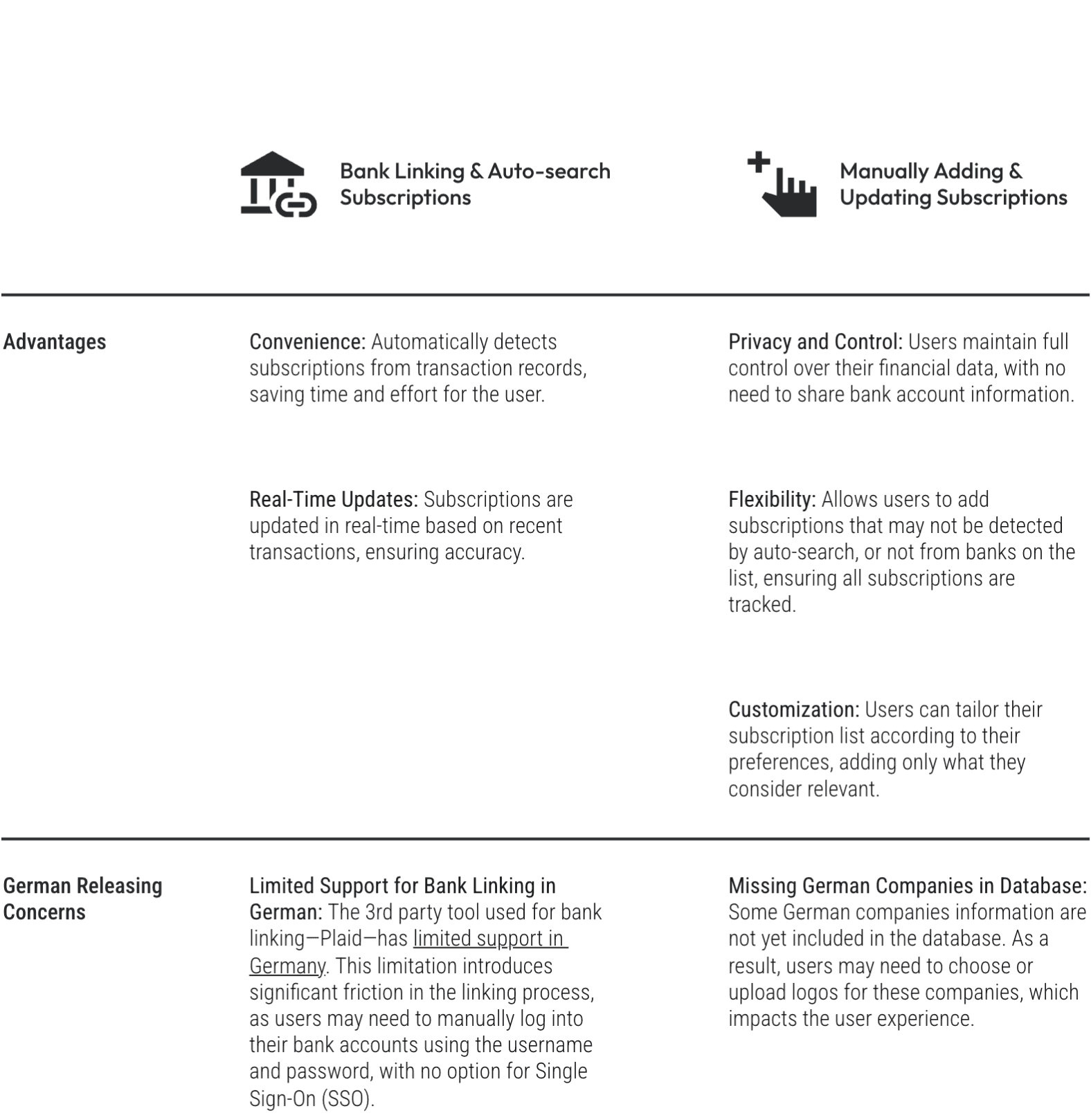
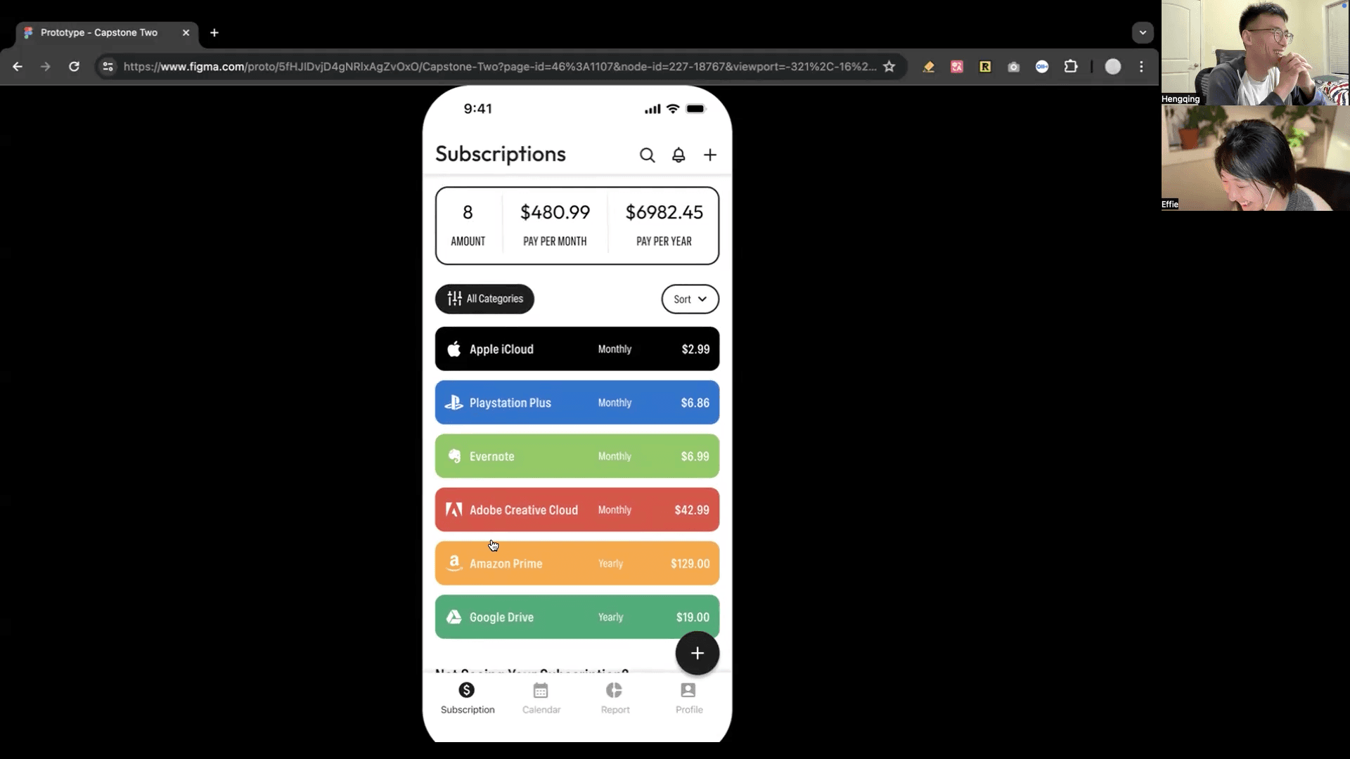
To learn from the existing design, I analyzed 4 top apps—Bobby, Whatssub, SubscriptionStopper, and Buddy, but found a striking divided when it turns to the addition of subscriptions:
3 apps demanded bank access, then auto-searching for subscriptions through transaction data.
Conversely, 1 app relied solely on requiring users to manually add all subscriptions.
None bridged the two..


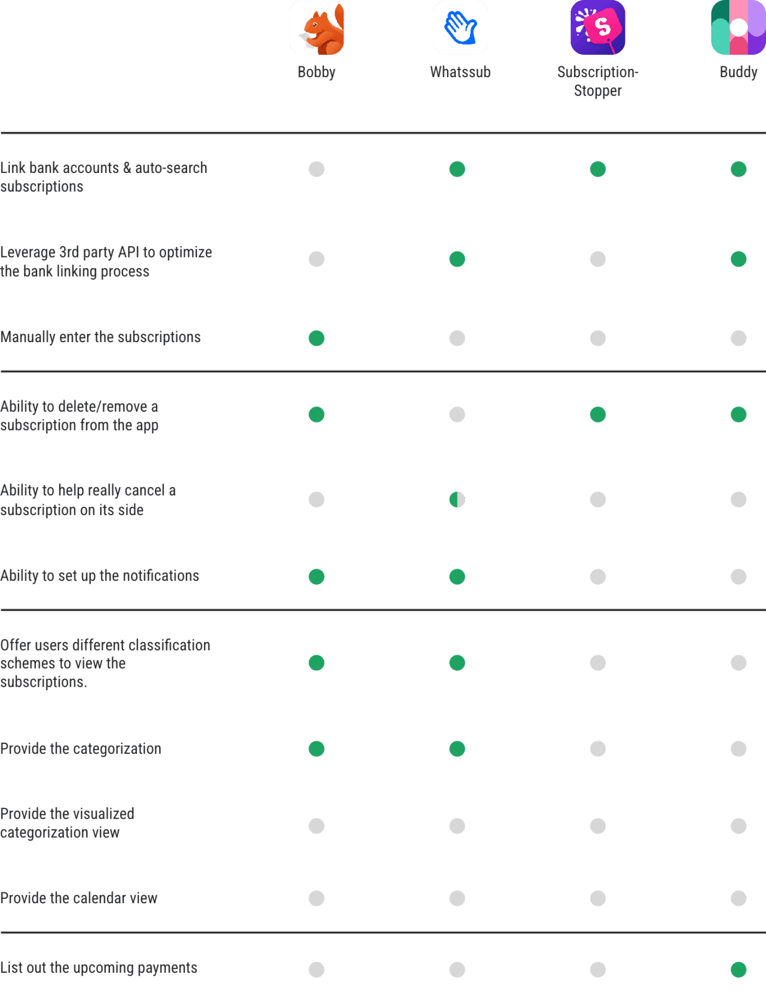
The Engineering Elephant in the Room
While I wasn’t privy to these apps’ internal debates, as a former engineer, I recognized the unspoken blocker: hybrid models demand 2x+ the engineering effort—a cost most teams cannot ignore.
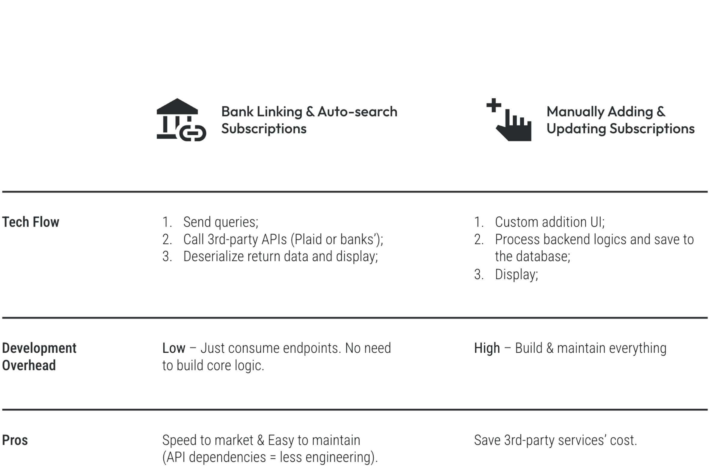
Why Hybrid Pays for Itself
Yes, hybrid models cost more upfront. Now the focus becomes—How to get stakeholders’ support to move forward with the hybrid model?
Real life isn’t binary! With the analysis below, it’s not hard to conclude that—With the hybrid model, the additional engineering “cost” is actually market expansion infrastructure, because it caters to:
User Needs:
For John: Bank linking & Auto-search (Automation) = efficiency.
For Lena: Manually adding & updating (Manual) = trust.
For general users: Hybrid = choices (Psychology principle—Need for Autonomy).
Need for Autonomy (Deci & Ryan, Self-Determination Theory)—People crave volitional control over their actions. “When users dictate how they interact with a system, engagement deepens.” (Deci, 2000)
Business Impact:
For the business goal: Hybrid = broader user base.
For the German release: Hybrid = flexibility and better coverage.
From Insights to Action
Now it’s the time to capture the essential takeaways from the research and synthesis, setting a clear direction and prioritization for the design phase.
Design
Prioritizations
Insights
Users
Needs
Business
Goals
Stakeholder
Supports
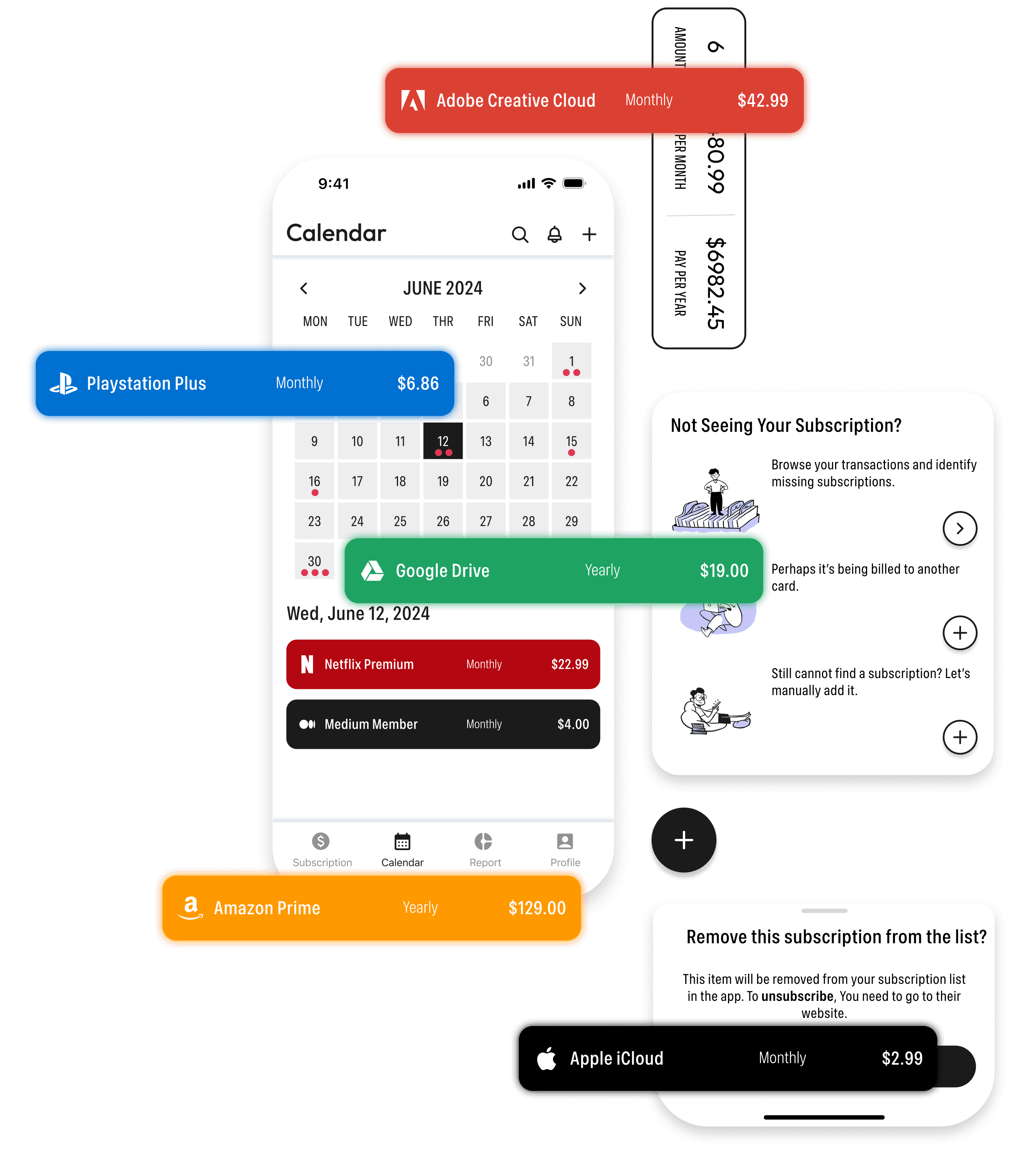
Offer Hybrid Subscription Addition Methods
As discussed above, provide both bank-linking and manual addition ways for John's efficiency & Lena's privacy, align with business goals, and ensure flexibility.
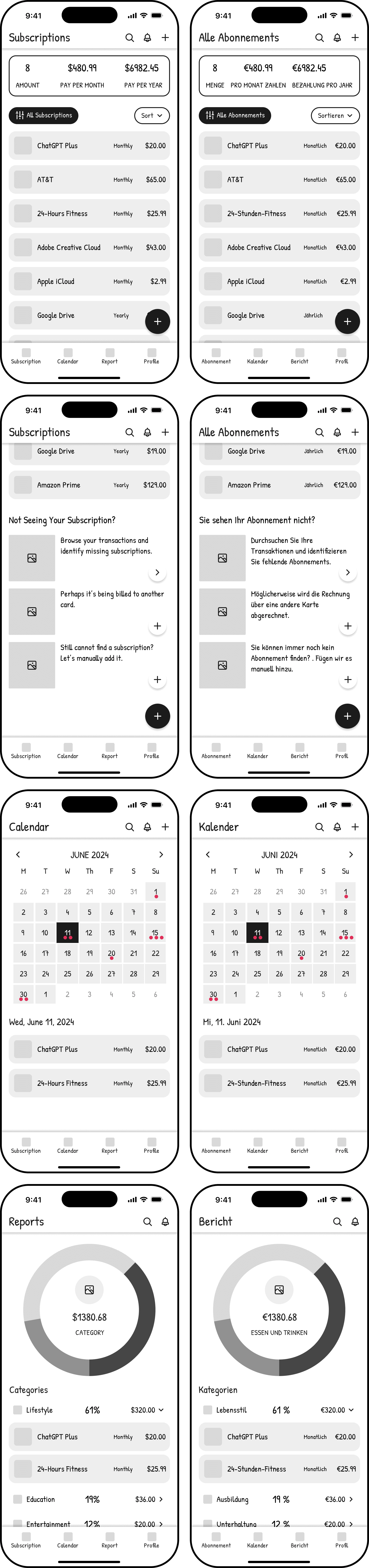
Utilize Brand Logos + Colors
Display corresponding brand logo with its prime color for the subscription item, as graphic info is processed faster by the human brain than text, improving user recognition and interaction.
Show yearly spending totals
Provide a yearly summary of their total payments, encourage mindful management.
Ensure Simple and Intuitive Interactions
Limit core actions like adding, deleting, setup notification, etc to ≤3 steps.
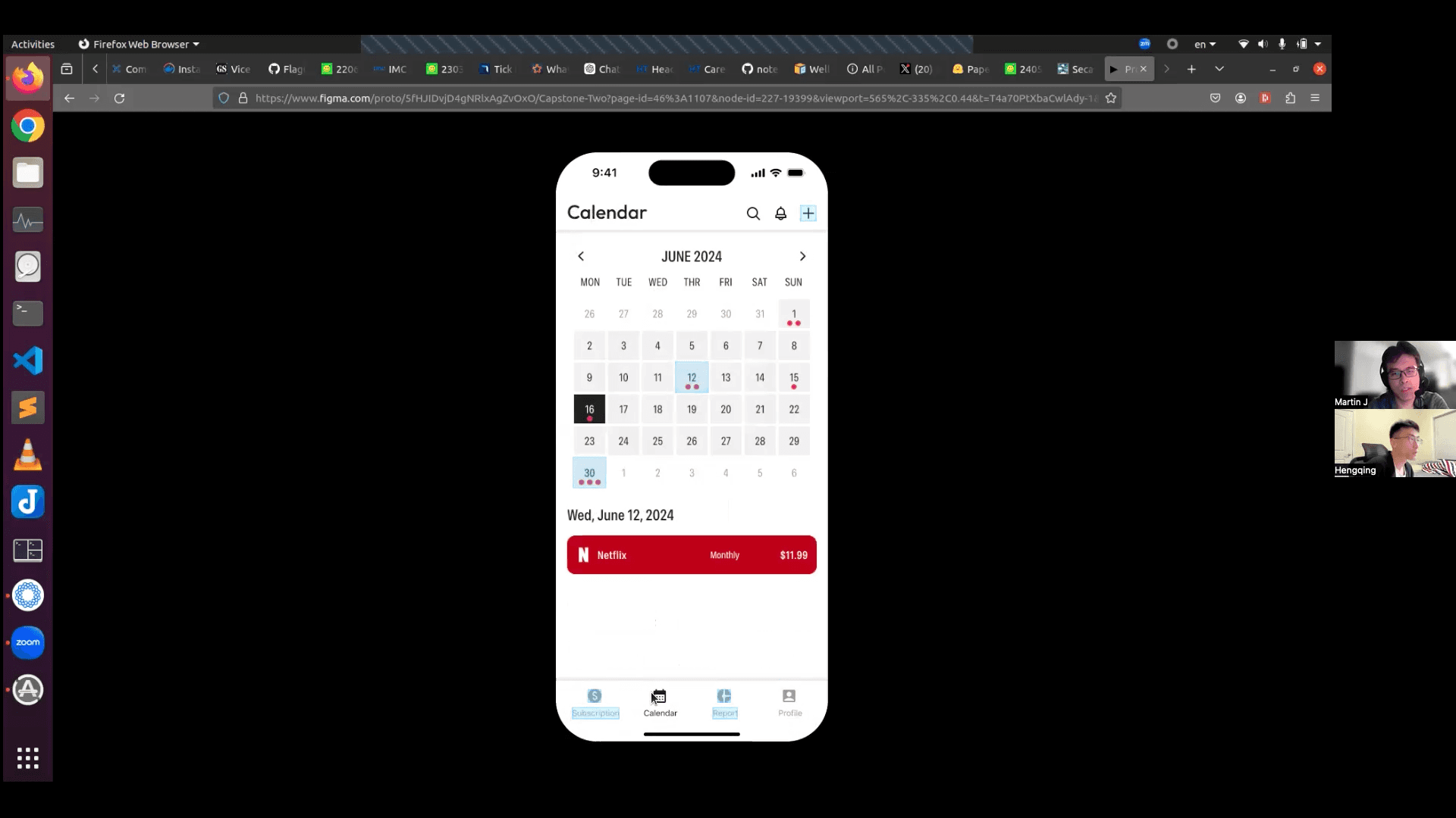
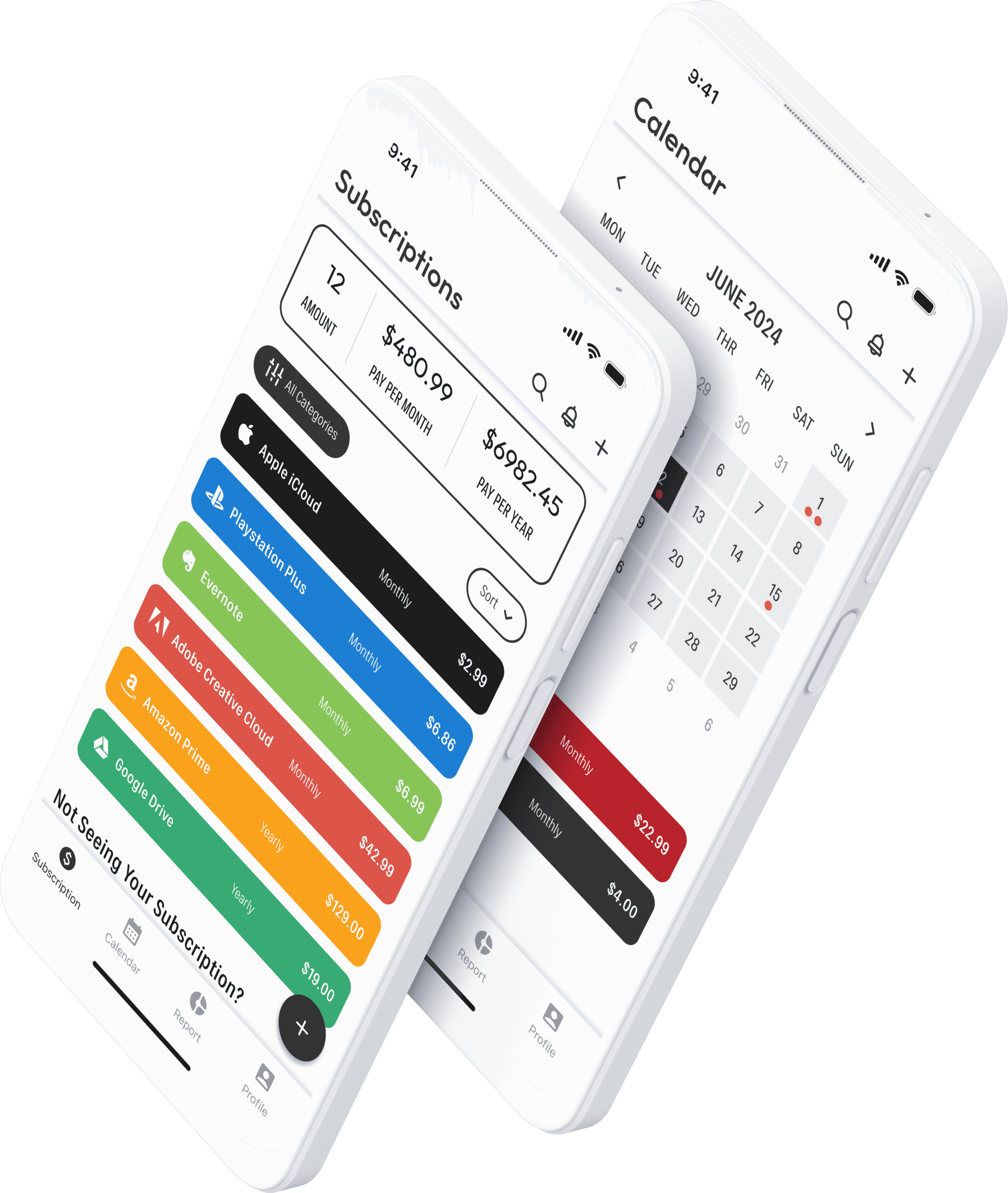
Give Users a Comprehensive View, following the Information Architecture (IA) Principle of Multiple Classification
Provide calendar views to give a holistic picture of users’ monthly subscriptions and monitor upcoming payments.
Provide categorized analytics to offer users an in-depth view, aiding in better management and decision-making.
Principle of Multiple Classification—People have different ways of looking for information. Offering users several different classification schemes can help them browse and find the contents.

User Flows
There were four Red Routes identified and prioritized, addressing the most common and essential needs:
"Show me everything" (Comprehensive subscription view)
"Add this now" (Hybrid subscription addition)
"Warn me before they charge" (Notification setup)
"Let me escape" (1-click unsubscribe)

Wireframe
Created wireframes to not only evaluate the core layout and structure but also verify that the design accommodates languages’ differences, ensuring a seamless experience for both English & Germany users at the very beginning.

How Tests Revealed Redesigns
With high-fidelity prototypes in hand, I ran 4 usability tests on 4 tasks (16 tasks total). The results revealed unexpected gaps between some of my assumptions and real user behavior. For examples:
Though 87.5% completion rate (14/16 tasks) sounded decent, I saw how users struggled.
Polarizing reactions exposed flawed assumptions (e.g., brand colors felt "fun" to some, "chaotic" to others).
Critical features going unnoticed (like the floating action button, ignored by 100% of testers).
Workarounds users invented (e.g., goto Calendar page to setup notification; Swiping subscription items despite no visual cues).
Edge cases users questioned (“How it gonna be like if more than 3 subscriptions charge on the same day?”).


The 8 Iterations That Mattered
The 8 key problems uncovered and the design iterations made to address them:

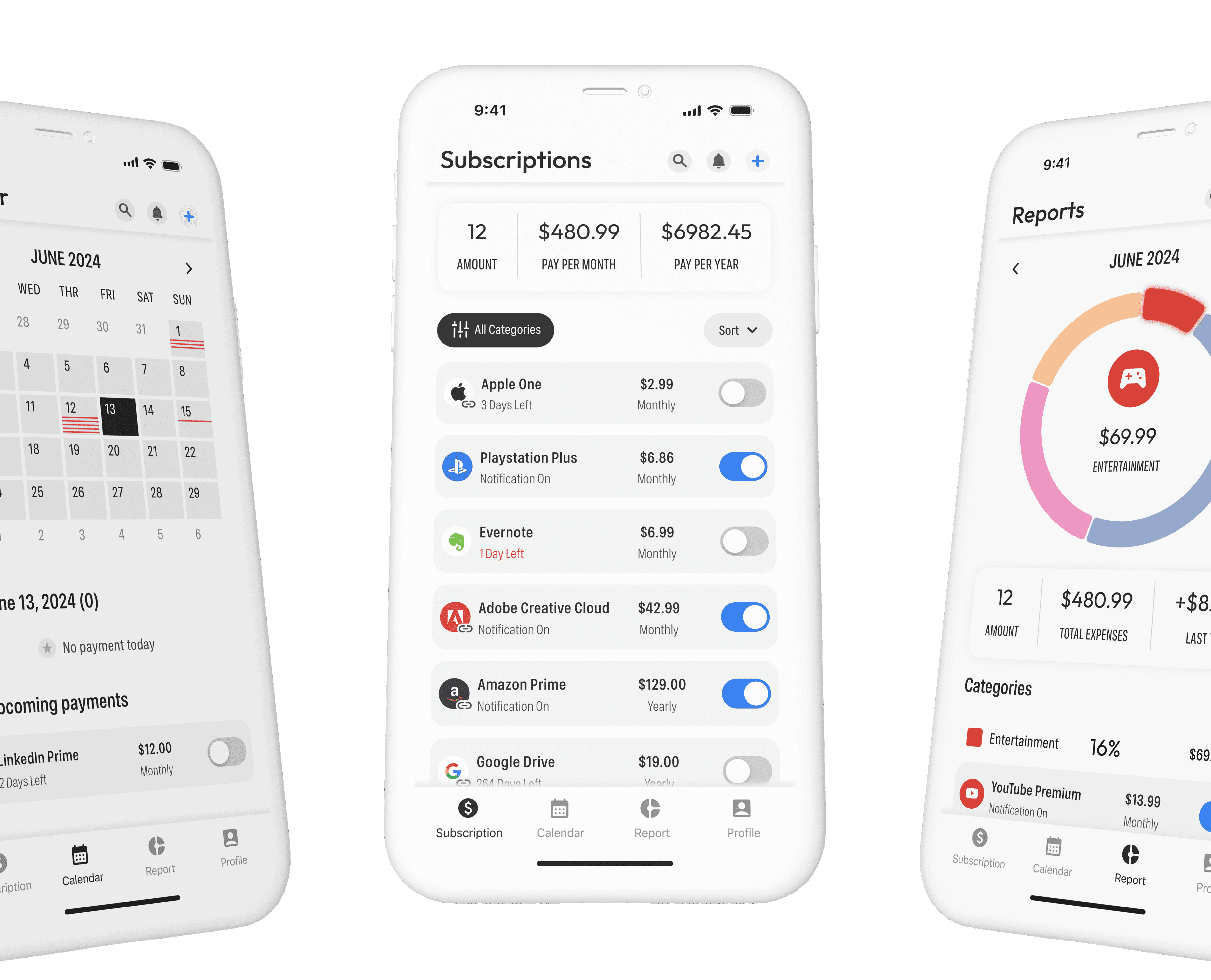
Killed the rainbow → Logos-only for clarity. (Direct to)
Notification toggles → One-click setup. (Direct to)
Buried FAB → Prominent top-right "Add". (Direct to)
Link badges → Auto vs. manual clarity. (Direct to)
Line-based calendar → Scalable reminders. (Direct to)
Calendar notifications → Dual-path setup. (Direct to)
High-contrast donut charts → Interactive reports. (Full version)
Reordered dialog actions → Priority to frequent tasks. (Full version)
AFTER
The Proof: Second Testing Round
Same tasks, iterated design:
100% success rate for critical flows (vs. 87.5% initially)
About 30% faster tasks completion
Zero confusion on subscription types
Breaking Down the Fixes
Below are the details how real behavior and observations reshaped the design:


BEFORE


BEFORE
Rethinking the Use of Branding/Prime Colors
The initial idea behind displaying each subscription's brand color was to:
Improve visual distinction
Add playful energy
However, tests revealed that this approach may not work as intended.
This is the number of the issue identified during usability testing.
Close
Frictions When Setting up the Notification
Both the product requirements and the research highlighted that setting up notifications is a vital and frequently used feature in the app. Making this operation easy to find and interact with is a priority.


BEFORE


Logo with Name + Removed Brand Color Assignment: For each subscription, retaining the brand logo & name is sufficient for users to quickly recognize and distinguish between. Based on test results, I removed the brand color feature, prioritizing objective, clarity and user understanding.
This is the corresponding iteration addressing the #1 issue.
Close
One-Click Notification Toggle: As standardizing the subscription item bar's color, introduced a toggle button that serves as a one-click shortcut to set a notification.
Toggling it on will set up a one day before the next billing date notification and trigger a toast message below. This:
Increased visibility: It’s immediately visible to users;
Reduced steps: 3-step process → 1 tap;
Immediate feedback: The toggle itself provides instant visual feedback;
Reusable like a plugin: Can be flexible and easy to reuse in different contexts, improves modular and reduces engineering efforts.
AFTER


Observation 2—Redundancy Backfired
When I specifically pointed FAB out, they were confused, questioned how it differs from the "Add" button in the top right corner (in fact, no difference—the functionality was identical).
Participants also seemed show little enthusiasm for having the same function available in multiple places. It created decision paralysis rather than convenience in this case.
BEFORE
Ineffective Use of the Floating Action Button
In the initial design, a floating action button (FAB) was introduced as a "quick add" shortcut, complementing:
Top-right "Add" button
Bottom "Not seeing your subscription?" section
Observation 1—0% Discovery Rate
Unfortunately, all users missed the FAB entirely. In contrast, users quickly noticed the “Add” function buttons on the top bar.
Better Differentiating Auto-Searched & Manually Added Subscriptions
The problem here is:
Auto-linked subscriptions update dynamically
Manually added ones require user maintenance
In current design, users have to sort and/or filter to distinguish between or check the subscription detail dialog for this info
An easier distinction would help users quickly identify which items they need to keep updating, can this be made more immediately visible?


Auto vs. Manual Clarity: To better differentiating between auto-searched and manually added subscriptions, a subtle yet effective element—a link badge positioned at the bottom right of the logo is introduced. Value immediate recognition and awareness.
Auto-linked and searched items: With subtle badge (bottom-right of logo)
Manual items: No badge = need user maintenance
Highlight top-right "Add": FAB is abandoned to avoid the confusion it caused. The primary method for adding subscriptions is now focused on the top right "Add" button (100% discovery rate in tests).
Leave the bottom helper section with clear action labels.

AFTER


Scalability and Consistency Issue of Calendar’s Number Indicator
On the Calendar page, the initial design used red dots to indicate due subscriptions (max 3 dots) this day.
There are two potential solutions to quickly address it. But both have drawbacks.
BEFORE
User Expectation for Setting Up Notifications on the Calendar Page
The original design of the Calendar page only displayed subscriptions on their billing dates. For the rest of dates, it just shows a message “No payment”.

BEFORE
AFTER
Calendar as Control Hub:
Interactive calendar dates—Displaying the next upcoming payments on days without any subscriptions, reused the subscription item, allowing users to set up notifications via the quick-access toggle button. This approach provides users an additional entry point to set up notifications directly from the Calendar page.
Minimized engineering efforts by reusing subscription item component.
Line-Based Indicator Introduced: Which proposed:
Scalability: It allows the calendar to efficiently scale from handling days with just a few subscriptions to those with many, without sacrificing visual clarity.
Visual Simplicity: The use of thin lines keeps the design clean and avoids overcrowding the calendar with numbers or other complex indicators.
Consistency: By utilizing a uniform system of lines, the calendar maintains a consistent visual language, making it easier for users to understand at a glance.

For days with 1 to 5 subscriptions, a corresponding number of thin lines is displayed beneath the date.
For days with more than 5 subscriptions, a unified block is displayed, signaling that there are several items on that day.


Learnings and Reflections
Throughout this project, I’ve gathered some key insights, both from research & design processes and the usability testing, which will continue to shape my approach and mindset to future works.
One interesting observation from usability testing was how naturally some participants tried to swipe the subscription item bar on the subscription page, despite no visual cues/signifier, to access actions like deleting or setting up notifications.
This insight has sparked my curiosity. If I had more time, I would further explore and test swipe gestures as a potential interaction, and investigate how it could streamline the user experience even further. This observation also highlights always leave room for discovery, and always being open to user behaviors even not align with initial assumptions.
The Importance of Continuous Testing and Observation
1.
Rooting Design Decisions in Objectivity
2.
My understanding is to move beyond simply recognizing and acknowledging subjectivity. It’s essential to take a step further—to question why having that feeling, does it apply to everyone? By probing deeper behind an instinct (no matter what methods you choose to use), we can likely uncover objective insights that either support or challenge those initial reactions. This process could transform intuition into informed judgment. In doing so, design decisions become more thoughtful, combining the emotional resonance with the objective validation.