
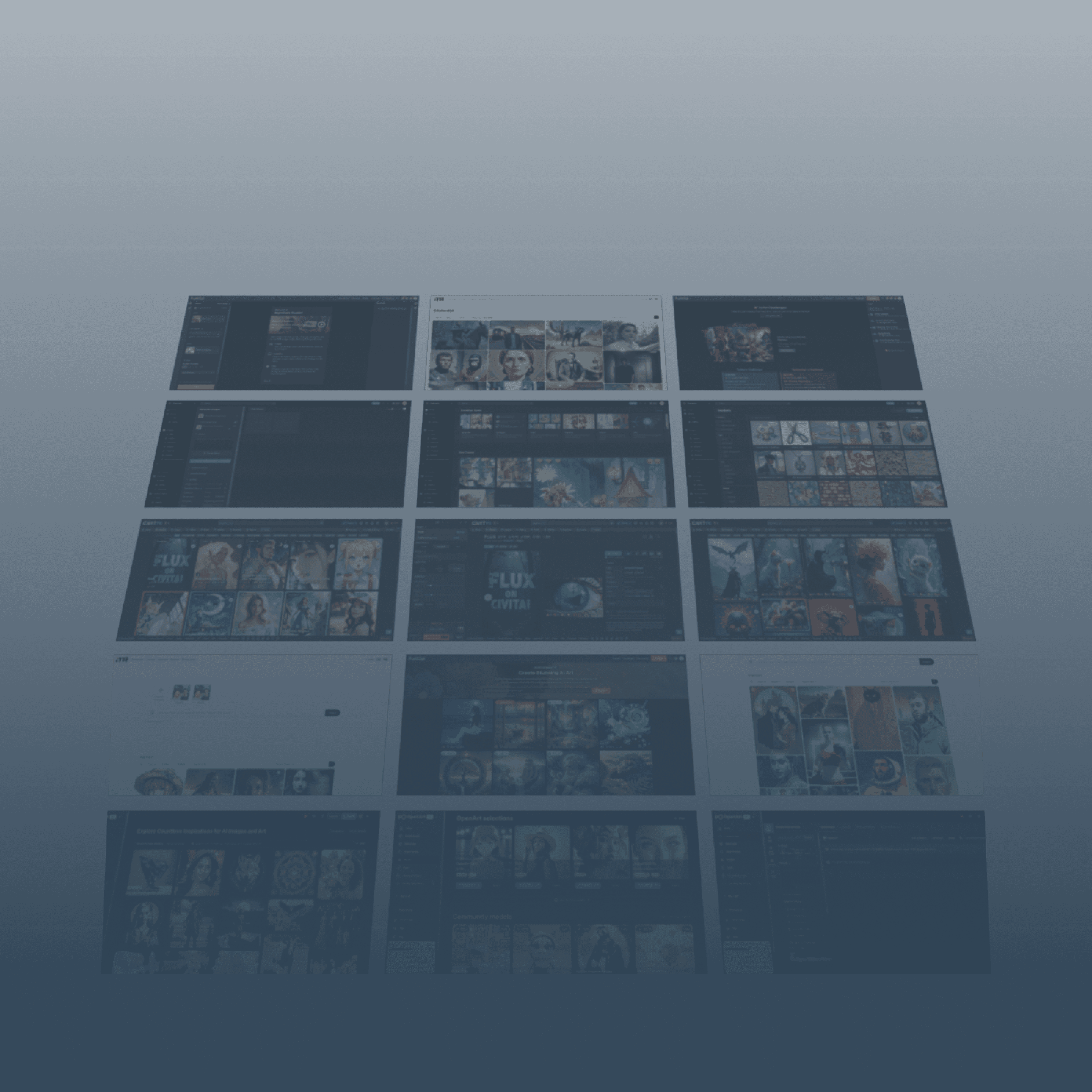
This project is an internship work for an early-stage startup company called Srsti.art.
As the UX team lead, I drove and participated in the design of this artist-first platform that empowers visual artists to create, own, and monetize AI models trained on their unique styles.
Through research and testing, we met the company's business requirements, streamlined the user experience, and reduced cognitive load to improve ease of use for artists.
See Collaboration Board
Public Models

Vintage book
Zu Pink
106
Fright fall
Marcos Abdallah
2k+

Female expression
Aurelia Karina
2k+
Female expression
Aurelia Karina
2k+
Graphite creature
Liza Perelman
2k+
Floral portraits
Amarylis Hibon
2k+
Public Models
Vintage book
Zu Pink
106
Female expression
Aurelia Karina
2k+
Srsti.art
Srsti.art
Srsti.art
An artist-first AI platform
An artist-first AI platform
An artist-first AI platform
2024
2024
Website
Website
UI/UX design
UI/UX design
Internship
Internship
My Role:
Design team lead
Duration:
5 weeks
Research & Design Methods:
Competitor research, secondary research, user flows, dependency maps, sketch, wireframe, branding guide, high-fidelity mockups, prototype, usability testing
Outcome:
Two flows’ design were approved by the company;
Overall 80% usability tests success.
Collaboration with:
Shiv (Company POC, in Toronto)
Brittney (Designer, in Washinton D.C)
Casandra (Designer, in Hawaii)
Cynthia (Designer, in NYC)
Dev Team (Global wide)
Shiv (Company POC, in Toronto)
Brittney (Designer, in Washinton D.C)
Casandra (Designer, in Hawaii)
Cynthia (Designer, in NYC)
Dev Team (Global wide)
Learnings
( Read More )
Design systems are essential.
Ongoing design alignment is a must to ensure cohesive outcomes.
My methodologies honed in engineering projects are equally effective in driving design work.
8/2
8/5
8/8
8/9
8/12
8/13
Style guide
High-fidelity mockup
Proto-type
Hand-over
Usability testing
The team discussed and voted to finalize the flows and layouts.
Hengqing—Present & handover deliverables
Hengqing—Model red route 1 & test
Brittney—Profile red route 1, 2 & test
Casandra—Profile red route 3 & test
Cynthia—Model red route 2 & test
7/8
7/12
7/16
7/24
7/26
Team onboarding
Kick-off & Project plan
Research
Synthesis
Wireframe
Hengqing—Proposed using user flows and dependency maps to better split & streamline the design work, give ETA, and minimize bottlenecks.
The team reviewed focus group videos from the company. Each member analyzed two competitors' platforms using SWOT analysis.
Hengqing—Drove kick-off (Specified problems, narrowed down project scopes).
Timeline
Timeline
Here is the final timeline for the project, though it was dynamically adjusted throughout the condensed project period. It outlines the overall design process and some key tasks. For a detailed view of how I led the project and the team, please check our Collaboration Board on FigJam.

A snapshot of the UX team collaborating with company stakeholders via Zoom—thanks to Cynthia for capturing this teamwork moment in action!
A snapshot of the UX team collaborating with company stakeholders via Zoom—thanks to Cynthia for capturing this teamwork moment in action!
problem statement & Project scope
problem statement
& Project scope
The project began with broad and vague initial materials. Given the tight timeline (5 weeks), I first led a kick-off meeting with the company to clarify the business goals, user pain points, and the stakeholder support. Which laid the solid foundation for the rest of the project, and allowed us to proceed with a clear vision and a focused approach.
Because these are the three things that every design needs to be successful:
It solves a problem.
It’s easy for users.
It’s supported by stakeholders.

1
Business Goal
Current generative AI requires extensive prompt texts and produces unpredictable results.
Current generative AI requires extensive prompt texts and produces unpredictable results.
Srsti.art aims to empower artists to create, own, and monetize personalized AI models trained by their unique style artworks.
Srsti.art aims to empower artists to create, own, and monetize personalized AI models trained by their unique style artworks.
The models would help generate consistent, style-specific art with simplified prompts, usable for commercial purposes.
The models would help generate consistent, style-specific art with simplified prompts, usable for commercial purposes.

2
Users’ Pain Point
Users’ Pain Point
The team gathered insights from the focus group discussion and user interview videos provided by the company, the project’s target users and their traits are quite clear — Artists who are likely not very tech-savvy.
The team gathered insights from the focus group discussion and user interview videos provided by the company, the project’s target users and their traits are quite clear
— Artists who are likely not very tech-savvy.
When talking about nowadays AI platforms
“Over-engineered”
“Over-engineered”
is what most of them complaint.
is what most of them complaint.
3
Stakeholder Support
Legal & Policy Landscape
AI Trend Analysis & Implications
Community Building & Outreach
Not in the scope
Legal & Policy Landscape
AI Trend Analysis & Implications
Community Building & Outreach
Not in the scope
Artist Onboarding
Deprioritized
Artist Onboarding
Deprioritized
Art Marketplace
Deprioritized
Art Marketplace
Deprioritized
Public View:
Showcase artist's portfolio, bio, and social links.
Display AI-generated artwork samples.
Option to contact the artist for commissions or custom the AI requests.
Inputs:
Artist’s own artwork.
Support multiple inputs, uploading many art pieces at the same time
Very simple prompt text, eg: Micky Mouse.
Outputs:
New art piece follows the same style of the artist.
Preview the generated artwork.
Model Training:
Visual progress bar or animation to show model training status.
Customization Options:
Allow artists to adjust parameters for model fine-tuning.
View model training progress and generated art entrypoint.
Set pricing and licensing terms for their AI model.
Artist Dashboard:
Manage artwork uploads.
Artist Profile
Model Related
Artist Profile
Model Related
Public View:
Showcase artist's portfolio, bio, and social links.
Display AI-generated artwork samples.
Option to contact the artist for commissions or custom the AI requests.
Inputs:
Artist’s own artwork.
Support multiple inputs, uploading many art pieces at the same time
Very simple prompt text, eg: Micky Mouse.
Outputs:
New art piece follows the same style of the artist.
Preview the generated artwork.
Model Training:
Visual progress bar or animation to show model training status.
Customization Options:
Allow artists to adjust parameters for model fine-tuning.
View model training progress and generated art entrypoint.
Set pricing and licensing terms for their AI model.
Artist Dashboard:
Manage artwork uploads.
Final Project Scope:
Design and build the prototype for the Srsti.art website from scratch, focusing on two priority features:
Model Related: Enable artists to train and maintain their own AI models. Then use the model to generate new artwork.
Artist Profile: Allow artists to manage their models, protect the originality and monetize their work.
Set the Right Expectation Upfront:
To ensure alignment and support from all stakeholders, I focused on collaborating with them clarifying and controlling/cutting the project scope. Because:
Prioritizing the key features, defining and building a minimum viable product (MVP) enabled the company to quickly evaluate and iterate over.
This approach also allowed UX team to deliver value quickly while setting realistic expectations within this tight timeline.
The stakeholders bought-in, which helped secure their continuous support throughout the internship.

Competitor Research
—Curating Elegance, Avoiding Pitfalls
The team then conducted competitor research focusing on six relevant AI platforms: OpenArt, ImagineMe, exactly.ai, Civitai, NightCafe, and Scenario.
The goal was to identify beneficial design patterns to learn from while being mindful of pitfalls to avoid.
For instance, in model-related flows, we observed several common poor user experiences.
Information overload
Excessive information can overwhelm users and lead to cognitive overload.
Excessive information can overwhelm users and lead to cognitive overload.
Confusion in model interaction
Confusion in model interaction
Users face confusion regarding model selection and detail views. Many platforms inconsistently use clicks to either view model details or select/switch the model.
Users face confusion regarding model selection and detail views. Many platforms inconsistently use clicks to either view model details or select/switch the model.
Fail to set time expectations
Fail to set time expectations
It is crucial to set realistic expectations for the time required to train models or generate images earlier in the process.
It is crucial to set realistic expectations for the time required to train models or generate images earlier in the process.
Use of jargon
Technical jargon and terms can be unclear to users without a background.
Technical jargon and terms can be unclear to users without a background.
So,
what to Set us apart?
So,
what to Set us apart?
We will focus on reducing cognitive load! Some learnings:
Providing an intuitive interface and interaction—we will emphasize visual clarity and a clean, uncluttered design that prioritizes ease of use and accessibility for artists of all skill levels.
In model related flows, providing estimated time needed upfront—helps manage user expectations and enhances the experience.
And clearly defining model card clicking actions—to avoid confusion and ensure clear and defined user interactions.
Clarify the user flows
Clarify the user flows
Clarify the user flows
In the Synthesis stage, we chose user flows to break down the detailed steps related to the Model & Profile features with the company POC (Point of Contact). This also gave us a big picture of the subsequent design workload, and helped in splitting tasks.
The team divided two features into a total of 10 Red Routes, here shows Model Red Route 1 — the user selects a model and enters prompts to generate the new artwork.


Start
End
Go to the Generate page
Go to the Model section
Choose from your own Models list
Type into the prompts you want to generate
Wait until the preview is generated
Output the final result
Browse the community Models
Choose a Model from community
Use your own Model?
Have own Model?
Like to keep the preview?
Training model flow
Yes
Yes
Yes
No
No
No
Start/End
Conditional Statement
Execution
Red Route Flow
Dependency map
Dependency map
Independent Component
Shared Component
Dependency
Based on my past engineering experience, with all Red Routes’ user flow charts, I proposed building dependency map—a "divide and conquer" approach, breaking the big project into smaller components while identifying hidden dependencies.
Outcomes:
Allowed for better design workload estimation and task allocation.
Identified critical shared components to be aligned early to smooth collaboration and avoid blocking.
Hengqing’s Work
Casandra’s Work
Cynthia’s Work
Generation page
Selected model section
Models page/section
Individual model card
Model details page
Price section
Artist profile page
AI Generated samples’ gallery
Sample selection dialog/pool
Artist info section
Edit info widget
Generated examples
Train new model page/section
Name model section
Upload images section
Browsing & uploading widget
Training progress widget
Training completed notif widget
Licensing terms section
Prompts section
Output section
Preview & result section
Brittney’s Work
Profile Red Route 1
The user views/updates their profile info.
Profile Red Route 2
The user views and edits their owned/trained models.
Model Red Route 2
The user trains one model using their own artwork.
Model Red Route 1
The user selects a model and inputs prompts to generate new artwork. All subsequent contents focus on my design work for this flow.
Hengqing’s Work
Generation page
Selected model section
Models page/section
Prompts section
Output section
Preview & result section
Model Red Route 1
The user selects a model and inputs prompts to generate new artwork. All subsequent contents focus on my design work for this flow.
wireframe discussion
wireframe discussion
wireframe discussion
I followed a systematic approach to design the layout and structure, prior to having any empirical data.
By breaking down user’s System 1 thinking when interacting with a flow into four stages:
Filter
Act
Interpret
Store
And applying psychological principles, UX laws, and visual guidelines to these stages, I focused on reducing cognitive load—our primary design goal.
There are two layout options I proposed for Model Red Route 1, where users select a model and enter prompts to generate new artwork.
System 1 Thinking
—fast, automatic, subconscious decision-making
Filter
—user’s brain instinctively filters out information
Interpret
—user tries to understand what’s happening
Act
—user takes action
Store
—user mentally retains their experience
1
Filter Stage Notation
2
Interpret Stage Notation
3
Act Stage Notation
4
Store Stage Notation
Model
Prompt
Output
Plasticine fairytales V6
Specific style
2k
Switch
Show Inspirations
(((...))) with dragon slayer sword, (Kentaro Miura manga book style), illustration, Berserk manga artstyle, manga, portrait, close up, fantasy, landscape, face, ancient ruins background
Aspect Ratio
portrait
landscape
square
Generate
Results
History
Color Palette
Generate ~6.1s/image
Model
Prompt
Generate
My Models
See All
Create a new model
2k
2k
2k
2k
Community Models
See All
2k
2k
2k
2k
2k
Random
Placeholder
Next
Prompt Inspirations
Generate ~6.1s/image
Output
Aspect Ratio
portrait
landscape
square
Color Palette
Model
Prompt
Generate
My Models
See All
Create a new model
2k
2k
2k
2k
Community Models
See All
2k
2k
2k
2k
2k
Random
Placeholder
Next
Prompt Inspirations
Generate ~6.1s/image
Output
Aspect Ratio
portrait
landscape
square
Color Palette
3
3
2
1
Chunking—Reduce cognitive load
Presenting users with info and tasks in discrete chunks (eg: one step at a time) helps them manage and process the info more effectively.
Chunking—Reduce cognitive load
Presenting users with info and tasks in discrete chunks (eg: one step at a time) helps them manage and process the info more effectively.
Social Proof
Users tend to adapt their behaviors based on what others do.
Reuse Components—Engineering consideration
Reduce engineering costs by control the number of unique components needed to achieve the same functions across the site.
Reuse Components—Engineering consideration
Reduce engineering costs by control the number of unique components needed to achieve the same functions across the site.
Progressive Disclosure—Reduce cognitive load
Revealing information gradually, only when it is needed. This helps users avoid being overwhelmed by too much information at once.
3
3
4
4
1
1
2
2
Scalability
Place to fit the additional settings or advanced settings in the future.
Set Right Expectation Upfront
Providing estimated time needed upfront, addressing concerns found in the competitor research.
Set Right Expectation Upfront
Providing estimated time needed upfront, addressing concerns found in the competitor research.
Responsibility—Engineering consideration
Easy to fit into the tablet and mobile screen size with minimum adjustment in code.
Responsibility—Engineering consideration
Easy to fit into the tablet and mobile screen size with minimum adjustment in code.
Visual Anchors
Elements used to guide users' eyes
Option 1
Option 1
Main Interaction Way - scroll up/down to highlight the section
My Models
Choose Your Model
Step
1
2
3
Create a new model
2k
2k
2k
2k
2k
2k
Details
Select
Public Models
See All
In Trend
Recommended
Used Before
2k
2k
2k
2k
2k
My Models
Choose Your Model
Step
1
2
3
Create a new model
2k
2k
2k
2k
2k
2k
Details
Select
Public Models
See All
In Trend
Recommended
Used Before
2k
2k
2k
2k
2k
Enter the Prompt
Random
Placeholder
Next
Prompt Inspirations
Sort
Step
1
2
3
Enter the Prompt
Random
Placeholder
Next
Prompt Inspirations
Sort
Step
1
2
3
Specify the Output
Color Palette
Aspect Ratio
portrait
landscape
square
Save
Step
1
2
3
Specify the Output
Color Palette
Aspect Ratio
portrait
landscape
square
Save
Step
1
2
3
Results
Plasticine fairytales V6
Specific style
2k
Switch
Prompt
(((...))) with dragon slayer sword, (Kentaro Miura manga book style), illustration, Berserk manga artstyle, manga, portrait, close up, fantasy, landscape, face, ancient ruins background
Color Palette
Aspect Ratio
square
Expand
Show Inspirations
Generate
6.1s/image.
Provide Clear Actions on Model Card
When users hover over a model card, two next actions "Details" and "Select" appear. This interaction is consistent across the site, reducing ambiguity about model interaction, addressing concerns found in the competitor research.
Provide Clear Actions on Model Card
When users hover over a model card, two next actions "Details" and "Select" appear. This interaction is consistent across the site, reducing ambiguity about model interaction, addressing concerns found in the competitor research.
3
3
Hick’s Law
Limiting the initial choices, enables users to make quicker decisions without being overwhelmed by too many choices.
Hick’s Law
Limiting the initial choices, enables users to make quicker decisions without being overwhelmed by too many choices.
Hick’s Law
Limiting the initial choices, enables users to make quicker decisions without being overwhelmed by too many choices.
Chunking
Splitting into sub-categories like "In Trend," "Recommended," and "Used Before," aligning with Miller's Law and reducing cognitive load by presenting users with a smaller, more digestible set of info.
Chunking
Splitting into sub-categories like "In Trend," "Recommended," and "Used Before," aligning with Miller's Law and reducing cognitive load by presenting users with a smaller, more digestible set of info.
Scalability
Place to fit the additional settings in the future.
Step Indicator
It shows users where they are in the process and how many steps remain.
Step Indicator
It shows users where they are in the process and how many steps remain.
Progressive Disclosure—Reduce cognitive load
Guiding users through a step-by-step flow, with only necessary information being shown at each step, avoids cognitive overload.
Progressive Disclosure—Reduce cognitive load
Guiding users through a step-by-step flow, with only necessary information being shown at each step, avoids cognitive overload.
4
4
2
2
3
Visual Hierarchy
The use of separate, clearly defined sections for each setting directs users' attention to important actions. And make sure the key components are prominently displayed and immediately accessible.
Visual Hierarchy
The use of separate, clearly defined sections for each setting directs users' attention to important actions. And make sure the key components are prominently displayed and immediately accessible.
Responsibility—Engineering consideration
With minimal adjustments required, the layouts fit well on tablet and mobile screens.
Responsibility—Engineering consideration
With minimal adjustments required, the layouts fit well on tablet and mobile screens.
2
2
Main Interaction Way -
pop up the dialog
when entering into the flow
Option 2
My Proposal & Team Discussion
Option 1—
Scrolling to highlight
Conclusion: After listing the pros & cons, I proposed Option 2. Following team discussions and a vote, we reached a consensus to Proceed with Option 2.
Option 2—
Dialogs pop up
Pros
Cons
Reduced cognitive load - Good
Easy & Intuitive interaction way - Good
Responsibility - Good
Scalability - Awesome
Consider Option 1 if the user base is more experienced or seeks quicker results, as it allows users to see everything at once and move forward quickly.
Choose Option 2 if users need a more guided experience, so we want to control the flow of the experience more tightly and guide users step by step.
Given our target users—”Artists who are likely not very tech-savvy”, and the higher engineering costs of Option 1, I recommended going with Option 2.
Reduced cognitive load - Good
Easy & Intuitive interaction way - Awesome
Responsibility - Good
Scalability - Good
Votes
Act (Stage): Multiple dialogs may slow down the process, especially for users in a hurry.
Visual: Hard to always maintain the visual balance on the last page across platforms.
Filter (Stage): Everything is still visible within the scroll area. This may look “high-efforts” to some users which leads to block-out or drop-off.
Act (Stage): If the page becomes too long, users might feel unsure about where to click or go next.
Store (Stage): Scrolling could hinder users’ ability to remember their previous actions, especially at the end of the scroll.
Engineering: Relatively intricate interactions, lead to ~15% more engineering efforts.
Proposals

Credits to Cynthia
Credits to Cynthia
Credits to Cynthia
Getting stakeholders’ supports!
Getting stakeholders’ supports!


Style guide
Style guide
The style guide wasn’t primarily driven by me, so I’ll briefly cover it here. But it was important to align with the branding discussed with the startup founder. The key objectives were simplicity, intuitiveness, and an openness to the future and AI's benefits.
Additional Elements: Besides typography and colors showed here. The style guide also includes icons, imagery (illustrations and images), grid, spacing, and a reference UI component set.
Typography: We chose Space Grotesk for titles to reflect the futuristic aspect of AI, and Open Sans for the body font to ensure legibility.
Color Scheme: To maintain simplicity and complement the possible vibrant user-generated content, we aimed to keep the website's colors as minimalistic as possible. Therefore, we selected a deep blue (#2D4255) and light gray (#EBEAEA) for a clean and cohesive look.
Color Scheme: To maintain simplicity and complement the possible vibrant user-generated content, we aimed to keep the website's colors as minimalistic as possible. Therefore, we selected a deep blue (#2D4255) and light gray (#EBEAEA) for a clean and cohesive look.
Space Grotesk
Space Grotesk
Space Grotesk
AaBbCcDdEeFf
JjKkLlMmNnOo
PpQqRrSsTtUu
VvWwXxYyZz
AaBbCcDdEeFf
JjKkLlMmNnOo
PpQqRrSsTtUu
VvWwXxYyZz
*&^%#<>$?!
1234567890
*&^%#<>$?!
1234567890
OpenSans
OpenSans
OpenSans
AaBbCcDdEeFf
JjKkLlMmNnOo
PpQqRrSsTtUu
VvWwXxYyZz
AaBbCcDdEeFf
JjKkLlMmNnOo
PpQqRrSsTtUu
VvWwXxYyZz
*&^%#<>$?!
1234567890
*&^%#<>$?!
1234567890

High-fidelity mockups
High-fidelity mockups
High-fidelity mockups
During the wireframe process, I continuously gathered feedback from stakeholders, adjusting content and layout. The mockups were based on the final version of the wireframe, with the same design north star of addressing the issues and goals identified in the research phase.
Steps
1
Choose Your Model
My Models
Create a new model
Open to public

Orange world
汪肥鸡
2k+
Private
Fingertip on phone
汪肥鸡

Edge of reality
汪肥鸡
Training
About 1.2h left for training
Community Models
Steps
1
2
Choose Your Model
My Models
Community Models
Vintage book
Zu Pink
2k+
Details
Select
Fright fall
Marcos Abdallah
2k+
Female expression
Aurelia Karina
2k+
In trend
Used before
Graphite creature
Liza Perelman
2k+
Floral portraits
Amarylis Hibon
2k+
See All
Steps
1
2
Choose Your Model
My Models
Create a new model
Open to public
Orange world
汪肥鸡
2k+
Private
Fingertip on phone
汪肥鸡
Edge of reality
汪肥鸡
Training
About 1.2h left for training
Community Models
Steps
1
2
Choose Your Model
My Models
Community Models
Vintage book
Zu Pink
2k+
Details
Select
Fright fall
Marcos Abdallah
2k+
Female expression
Aurelia Karina
2k+
In trend
Used before
Graphite creature
Liza Perelman
2k+
Floral portraits
Amarylis Hibon
2k+
See All
Steps
1
2

Details
Select
Fright fall
Marcos Abdallah
2k+
Avoid the model interactions confusion
Using hover interactions on the webpage, provided users the clear next steps when interacting with the model card.
Avoid the model interactions confusion
Using hover interactions on the webpage, provided users the clear next steps when interacting with the model card.
Avoid the model interactions confusion
Using hover interactions on the webpage, provided users the clear next steps when interacting with the model card.
Tab navigation for models separation
Based on company feedback, the My Models section was refined into sub-categories. To improve navigation and prevent excessive scrolling, I introduced a self-evident Tab as models separation.
Tab navigation for models separation
Based on company feedback, the My Models section was refined into sub-categories. To improve navigation and prevent excessive scrolling, I introduced a self-evident Tab as models separation.
Choose Your Model
My Models
Community Models
Vintage book
Zu Pink
2k+
Details
Select
Fright fall
Marcos Abdallah
2k+
Female expression
Aurelia Karina
2k+
In trend
Used before
Graphite creature
Liza Perelman
2k+
Floral portraits
Amarylis Hibon
2k+
See All
Steps
1
2

Click to copy
A cat with a big tail.


Enter the Prompt
Your prompt goes here...
Prompt Inspirations
Sort
Steps
1
2
Choose Your Model
My Models
Community Models
Vintage book
Zu Pink
2k+
Details
Select
Fright fall
Marcos Abdallah
2k+
Female expression
Aurelia Karina
2k+
In trend
Used before
Graphite creature
Liza Perelman
2k+
Floral portraits
Amarylis Hibon
2k+
See All
Steps
1
2
Click to copy
A cat with a big tail.
Enter the Prompt
Your prompt goes here...
Prompt Inspirations
Sort
Steps
1
2
Click to copy
A cat with a big tail.
Enter the Prompt
Your prompt goes here...
Prompt Inspirations
Sort
Steps
1
2
Steps
2
Steps
3
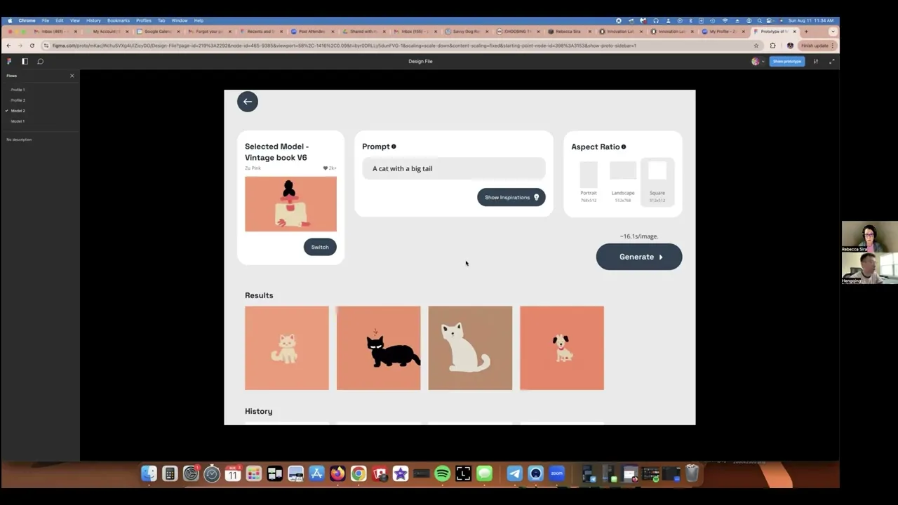
Selected Model - Vintage book V6
Zu Pink
2k+
Switch
Prompt
A cat with a big tail
Show Inspirations
Aspect Ratio
Portrait
768x512
Landscape
512x768
Square
512x512
Estimated 6.1s/image
Generate
History


Selected Model - Vintage book V6
Zu Pink
2k+
Switch
Prompt
A cat with a big tail
Show Inspirations
Aspect Ratio
Portrait
768x512
Landscape
512x768
Square
512x512
Estimated 6.1s/image
Generate
Results

History
Selected Model - Vintage book V6
Zu Pink
2k+
Switch
Prompt
A cat with a big tail
Show Inspirations
Aspect Ratio
Portrait
768x512
Landscape
512x768
Square
512x512
Estimated 6.1s/image
Generate
History
Selected Model - Vintage book V6
Zu Pink
2k+
Switch
Prompt
A cat with a big tail
Show Inspirations
Aspect Ratio
Portrait
768x512
Landscape
512x768
Square
512x512
Estimated 6.1s/image
Generate
Results
History
Selected Model - Vintage book V6
Zu Pink
2k+
Switch
Prompt
A cat with a big tail
Show Inspirations
Aspect Ratio
Portrait
768x512
Landscape
512x768
Square
512x512
Estimated 6.1s/image
Generate
History
Selected Model - Vintage book V6
Zu Pink
2k+
Switch
Prompt
A cat with a big tail
Show Inspirations
Aspect Ratio
Portrait
768x512
Landscape
512x768
Square
512x512
Estimated 6.1s/image
Generate
Results
History
Visualizing time expectations
Before users generate new artwork, provide a reminder of the estimated time required;
Once the "Generate" button is clicked, it transforms into a progressive bar, giving real-time updates on the task.
Visualizing time expectations
Before users generate new artwork, provide a reminder of the estimated time required;
Once the "Generate" button is clicked, it transforms into a progressive bar, giving real-time updates on the task.
Visualizing time expectations
Before users generate new artwork, provide a reminder of the estimated time required;
Once the "Generate" button is clicked, it transforms into a progressive bar, giving real-time updates on the task.
Integrating Aspect Ratio setting
As the Color Palette setting removed in this MVP, the Aspect Ratio was integrated into the final dashboard, eliminating the need for a separate dialog (as initially planned in the wireframe). The power default for aspect ratio further shortens the process.
Integrating Aspect Ratio setting
As the Color Palette setting removed in this MVP, the Aspect Ratio was integrated into the final dashboard, eliminating the need for a separate dialog (as initially planned in the wireframe). The power default for aspect ratio further shortens the process.
Integrating Aspect Ratio setting
As the Color Palette setting removed in this MVP, the Aspect Ratio was integrated into the final dashboard, eliminating the need for a separate dialog (as initially planned in the wireframe). The power default for aspect ratio further shortens the process.


prototype
prototype
This video only showcases the prototype for my part of the design work, Model Red Route 1 — where users select a model and input prompts to generate new artwork.
Testing & Results
Testing & Results
Testing & Results
The team conducted 5 usability tests with our target users—artists seeking to harness the power of AI. The results confirmed the effectiveness of our approach in reducing cognitive load and addressing common AI platform usability issues.
We also gathered valuable observations and feedback for future iterations. Here again, I only listed the results of the Model Red Route 1.


What Works
Clean, Focused Design: The clean, non-over-engineered design was positively noted, as users felt it focused on essential functions without unnecessary complexity. One participant said, “One of the things I like about it is it's very clean, it doesn't seem over-engineered which is something I have been really sensitive about lately, I just feel everything gets over-engineered these days. There are always lots of things you can do, but what are the best things.”
Intuitive Navigation: Users found the website easy to navigate. Even users with limited experience in AI art creation had a smooth experience with the tasks.
Clear Instructions: The instructions for model and art generation were appreciated for their simplicity and clarity.
Effective Micro-interaction: The generate button’s loading animation was well-received (it communicates the processing time).

What Doesn’t
Art styles?
Art Style References: Artists requested the ability to specify and display the art style type during model training and selection.

Female expression
Aurelia Karina
2k+
Generate?
Confusion with "Generate" Button: We used button “Generate” as one of the entry points to enter the generating new artwork flow, but there was confusion regarding its meaning and functions, people have different guesses about it.
Generate
Customized ratios?
Flexibility in Output Ratios: Artists wanted more control over defining the output ratios.
Aspect Ratio
Portrait
768x512
Landscape
512x768
Square
512x512
History organization?
History Search & Organization: One artist mentioned his pain points when navigating a cluttered history. He often struggle to find and iterate on past artworks. So the Generated History section needs more thoughtful design.
History


Check Out a Clip from My Testing Session
This is a Zoom meeting snippet from my usability testing session with Rebecca—illustrator and artist based in Portland, OR.
what I learned?
what I learned?
The Importance of a Comprehensive Design System
When working with multiple designers, ensuring consistency with either the existing designs or aligning all team members' outputs can be challenging. Therefore, a comprehensive and detailed design system is important. It should cover not just a typical style guide’s elements, but also include the UI components, site branding, and guidance on best practices for all elements.
Ensuring Consistency Through Ongoing Alignment
Even with a detailed design system, consistency isn't guaranteed. Different interpretations of "style" and "pattern" among team members can still lead to variations in presentation. Thus, regular design reviews and alignment are essential, especially after task splits and milestones, to ensure everyone is on the same page regarding the underlying "patterns" and "layouting".
Transferable Working Skills
I realized that the core working methodologies in design and engineering are very similar. The skills I honed in engineering—problem clarification, problem-solving, task splitting, issues discussions and resolution, communication (This time, as a team lead, over 50% of my time was spent in communication and alignment), and collaboration—are equally valuable and effective in driving design work.

2024
2024
UI/UX design
UI/UX
Internship
Internship
By Hengqing Wang
Hengqing Wang
Have Questions?
I’d Love to Hear From You!
Have Questions?
I’d Love to Hear From You!
This project is an internship work for an early-stage startup company called Srsti.art.
As the UX team lead, I drove and participated in the design of this artist-first platform that empowers visual artists to create, own, and monetize AI models trained on their unique styles.
Through research and testing, we met the company's business requirements, streamlined the user experience, and reduced cognitive load to improve ease of use for artists.
See Collaboration Board
Public Models
Vintage book
Zu Pink
106
Fright fall
Marcos Abdallah
2k+
Female expression
Aurelia Karina
2k+
Female expression
Aurelia Karina
2k+
Graphite creature
Liza Perelman
2k+
Floral portraits
Amarylis Hibon
2k+
Srsti.art
An artist-first AI platform
2024
Website
UI/UX design
Internship
My Role:
Design team lead
Duration:
5 weeks
Research & Design Methods:
Competitor research, secondary research, user flows, dependency maps, sketch, wireframe, branding guide, high-fidelity mockups, prototype, usability testing
Outcome:
Two flows’ design were approved by the company;
Overall 80% usability tests success.
Collaboration with:
Shiv (Company POC, in Toronto)
Brittney (Designer, in Washinton D.C)
Casandra (Designer, in Hawaii)
Cynthia (Designer, in NYC)
Dev Team (Global wide)
Learnings
( Read More )
Design systems are essential.
Ongoing design alignment is a must to ensure cohesive outcomes.
My methodologies honed in engineering projects are equally effective in driving design work.
8/2
8/5
8/8
8/9
8/12
8/13
Style guide
High-fidelity mockup
Proto-type
Hand-over
Usability testing
The team discussed and voted to finalize the flows and layouts.
Hengqing—Present & handover deliverables
Hengqing—Model red route 1 & test
Brittney—Profile red route 1, 2 & test
Casandra—Profile red route 3 & test
Cynthia—Model red route 2 & test
7/8
7/12
7/16
7/24
7/26
Team onboarding
Kick-off & Project plan
Research
Synthesis
Wireframe
Hengqing—Proposed using user flows and dependency maps to better split & streamline the design work, give ETA, and minimize bottlenecks.
The team reviewed focus group videos from the company. Each member analyzed two competitors' platforms using SWOT analysis.
Hengqing—Drove kick-off (Specified problems, narrowed down project scopes).
Timeline
Here is the final timeline for the project, though it was dynamically adjusted throughout the condensed project period. It outlines the overall design process and some key tasks. For a detailed view of how I led the project and the team, please check our Collaboration Board on FigJam.
A snapshot of the UX team collaborating with company stakeholders via Zoom—thanks to Cynthia for capturing this teamwork moment in action!
problem statement & Project scope
The project began with broad and vague initial materials. Given the tight timeline (5 weeks), I first led a kick-off meeting with the company to clarify the business goals, user pain points, and the stakeholder support. Which laid the solid foundation for the rest of the project, and allowed us to proceed with a clear vision and a focused approach.
Because these are the three things that every design needs to be successful:
It solves a problem.
It’s easy for users.
It’s supported by stakeholders.
1
Business Goal
Current generative AI requires extensive prompt texts and produces unpredictable results.
Srsti.art aims to empower artists to create, own, and monetize personalized AI models trained by their unique style artworks.
The models would help generate consistent, style-specific art with simplified prompts, usable for commercial purposes.
2
Users’ Pain Point
The team gathered insights from the focus group discussion and user interview videos provided by the company, the project’s target users and their traits are quite clear — Artists who are likely not very tech-savvy.
When talking about nowadays AI platforms
“Over-engineered”
is what most of them complaint.
3
Stakeholder Support
Legal & Policy Landscape
AI Trend Analysis & Implications
Community Building & Outreach
Not in the scope
Artist Onboarding
Deprioritized
Art Marketplace
Deprioritized
Public View:
Showcase artist's portfolio, bio, and social links.
Display AI-generated artwork samples.
Option to contact the artist for commissions or custom the AI requests.
Inputs:
Artist’s own artwork.
Support multiple inputs, uploading many art pieces at the same time
Very simple prompt text, eg: Micky Mouse.
Outputs:
New art piece follows the same style of the artist.
Preview the generated artwork.
Model Training:
Visual progress bar or animation to show model training status.
Customization Options:
Allow artists to adjust parameters for model fine-tuning.
View model training progress and generated art entrypoint.
Set pricing and licensing terms for their AI model.
Artist Dashboard:
Manage artwork uploads.
Artist Profile
Model Related
Public View:
Showcase artist's portfolio, bio, and social links.
Display AI-generated artwork samples.
Option to contact the artist for commissions or custom the AI requests.
Inputs:
Artist’s own artwork.
Support multiple inputs, uploading many art pieces at the same time
Very simple prompt text, eg: Micky Mouse.
Outputs:
New art piece follows the same style of the artist.
Preview the generated artwork.
Model Training:
Visual progress bar or animation to show model training status.
Customization Options:
Allow artists to adjust parameters for model fine-tuning.
View model training progress and generated art entrypoint.
Set pricing and licensing terms for their AI model.
Artist Dashboard:
Manage artwork uploads.
Final Project Scope:
Design and build the prototype for the Srsti.art website from scratch, focusing on two priority features:
Model Related: Enable artists to train and maintain their own AI models. Then use the model to generate new artwork.
Artist Profile: Allow artists to manage their models, protect the originality and monetize their work.
Set the Right Expectation Upfront:
To ensure alignment and support from all stakeholders, I focused on collaborating with them clarifying and controlling/cutting the project scope. Because:
Prioritizing the key features, defining and building a minimum viable product (MVP) enabled the company to quickly evaluate and iterate over.
This approach also allowed UX team to deliver value quickly while setting realistic expectations within this tight timeline.
The stakeholders bought-in, which helped secure their continuous support throughout the internship.
Competitor Research
—Curating Elegance, Avoiding Pitfalls
The team then conducted competitor research focusing on six relevant AI platforms: OpenArt, ImagineMe, exactly.ai, Civitai, NightCafe, and Scenario.
The goal was to identify beneficial design patterns to learn from while being mindful of pitfalls to avoid.
For instance, in model-related flows, we observed several common poor user experiences.
Information overload
Excessive information can overwhelm users and lead to cognitive overload.
Confusion in model interaction
Users face confusion regarding model selection and detail views. Many platforms inconsistently use clicks to either view model details or select/switch the model.
Fail to set time expectations
It is crucial to set realistic expectations for the time required to train models or generate images earlier in the process.
Use of jargon
Technical jargon and terms can be unclear to users without a background.
So,
what to Set us apart?
We will focus on reducing cognitive load! Some learnings:
Providing an intuitive interface and interaction—we will emphasize visual clarity and a clean, uncluttered design that prioritizes ease of use and accessibility for artists of all skill levels.
In model related flows, providing estimated time needed upfront—helps manage user expectations and enhances the experience.
And clearly defining model card clicking actions—to avoid confusion and ensure clear and defined user interactions.
Clarify the user flows
In the Synthesis stage, we chose user flows to break down the detailed steps related to the Model & Profile features with the company POC (Point of Contact). This also gave us a big picture of the subsequent design workload, and helped in splitting tasks.
The team divided two features into a total of 10 Red Routes, here shows Model Red Route 1 — the user selects a model and enters prompts to generate the new artwork.
Start
End
Go to the Generate page
Go to the Model section
Choose from your own Models list
Type into the prompts you want to generate
Wait until the preview is generated
Output the final result
Browse the community Models
Choose a Model from community
Use your own Model?
Have own Model?
Like to keep the preview?
Training model flow
Yes
Yes
Yes
No
No
No
Start/End
Conditional Statement
Execution
Red Route Flow
Dependency map
Independent Component
Shared Component
Dependency
Based on my past engineering experience, with all Red Routes’ user flow charts, I proposed building dependency map—a "divide and conquer" approach, breaking the big project into smaller components while identifying hidden dependencies.
Outcomes:
Allowed for better design workload estimation and task allocation.
Identified critical shared components to be aligned early to smooth collaboration and avoid blocking.
Hengqing’s Work
Casandra’s Work
Cynthia’s Work
Generation page
Selected model section
Models page/section
Individual model card
Model details page
Price section
Artist profile page
AI Generated samples’ gallery
Sample selection dialog/pool
Artist info section
Edit info widget
Generated examples
Train new model page/section
Name model section
Upload images section
Browsing & uploading widget
Training progress widget
Training completed notif widget
Licensing terms section
Prompts section
Output section
Preview & result section
Brittney’s Work
Profile Red Route 1
The user views/updates their profile info.
Profile Red Route 2
The user views and edits their owned/trained models.
Model Red Route 2
The user trains one model using their own artwork.
Model Red Route 1
The user selects a model and inputs prompts to generate new artwork. All subsequent contents focus on my design work for this flow.
wireframe discussion
I followed a systematic approach to design the layout and structure, prior to having any empirical data.
By breaking down user’s System 1 thinking when interacting with a flow into four stages:
Filter
Act
Interpret
Store
And applying psychological principles, UX laws, and visual guidelines to these stages, I focused on reducing cognitive load—our primary design goal.
There are two layout options I proposed for Model Red Route 1, where users select a model and enter prompts to generate new artwork.
System 1 Thinking
—fast, automatic, subconscious decision-making
Filter
—user’s brain instinctively filters out information
Interpret
—user tries to understand what’s happening
Act
—user takes action
Store
—user mentally retains their experience
1
Filter Stage Notation
2
Interpret Stage Notation
3
Act Stage Notation
4
Store Stage Notation
Model
Prompt
Output
Plasticine fairytales V6
Specific style
2k
Switch
Show Inspirations
(((...))) with dragon slayer sword, (Kentaro Miura manga book style), illustration, Berserk manga artstyle, manga, portrait, close up, fantasy, landscape, face, ancient ruins background
Aspect Ratio
portrait
landscape
square
Generate
Results
History
Color Palette
Generate ~6.1s/image
Model
Prompt
Generate
My Models
See All
Create a new model
2k
2k
2k
2k
Community Models
See All
2k
2k
2k
2k
2k
Random
Placeholder
Next
Prompt Inspirations
Generate ~6.1s/image
Output
Aspect Ratio
portrait
landscape
square
Color Palette
3
2
1
Chunking—Reduce cognitive load
Presenting users with info and tasks in discrete chunks (eg: one step at a time) helps them manage and process the info more effectively.
Social Proof
Users tend to adapt their behaviors based on what others do.
Reuse Components—Engineering consideration
Reduce engineering costs by control the number of unique components needed to achieve the same functions across the site.
Progressive Disclosure—Reduce cognitive load
Revealing information gradually, only when it is needed. This helps users avoid being overwhelmed by too much information at once.
3
4
1
2
Scalability
Place to fit the additional settings or advanced settings in the future.
Set Right Expectation Upfront
Providing estimated time needed upfront, addressing concerns found in the competitor research.
Responsibility—Engineering consideration
Easy to fit into the tablet and mobile screen size with minimum adjustment in code.
Visual Anchors
Elements used to guide users' eyes
Option 1
Main Interaction Way - scroll up/down to highlight the section
My Models
Choose Your Model
Step
1
2
3
Create a new model
2k
2k
2k
2k
2k
2k
Details
Select
Public Models
See All
In Trend
Recommended
Used Before
2k
2k
2k
2k
2k
Enter the Prompt
Random
Placeholder
Next
Prompt Inspirations
Sort
Step
1
2
3
Specify the Output
Color Palette
Aspect Ratio
portrait
landscape
square
Save
Step
1
2
3
Results
Plasticine fairytales V6
Specific style
2k
Switch
Prompt
(((...))) with dragon slayer sword, (Kentaro Miura manga book style), illustration, Berserk manga artstyle, manga, portrait, close up, fantasy, landscape, face, ancient ruins background
Color Palette
Aspect Ratio
square
Expand
Show Inspirations
Generate
6.1s/image.
Provide Clear Actions on Model Card
When users hover over a model card, two next actions "Details" and "Select" appear. This interaction is consistent across the site, reducing ambiguity about model interaction, addressing concerns found in the competitor research.
3
Hick’s Law
Limiting the initial choices, enables users to make quicker decisions without being overwhelmed by too many choices.
Chunking
Splitting into sub-categories like "In Trend," "Recommended," and "Used Before," aligning with Miller's Law and reducing cognitive load by presenting users with a smaller, more digestible set of info.
Scalability
Place to fit the additional settings in the future.
Step Indicator
It shows users where they are in the process and how many steps remain.
Progressive Disclosure—Reduce cognitive load
Guiding users through a step-by-step flow, with only necessary information being shown at each step, avoids cognitive overload.
4
2
3
Visual Hierarchy
The use of separate, clearly defined sections for each setting directs users' attention to important actions. And make sure the key components are prominently displayed and immediately accessible.
Responsibility—Engineering consideration
With minimal adjustments required, the layouts fit well on tablet and mobile screens.
2
Main Interaction Way -
pop up the dialog
when entering into the flow
Option 2
My Proposal & Team Discussion
Option 1—
Scrolling to highlight
Conclusion: After listing the pros & cons, I proposed Option 2. Following team discussions and a vote, we reached a consensus to Proceed with Option 2.
Option 2—
Dialogs pop up
Pros
Cons
Reduced cognitive load - Good
Easy & Intuitive interaction way - Good
Responsibility - Good
Scalability - Awesome
Consider Option 1 if the user base is more experienced or seeks quicker results, as it allows users to see everything at once and move forward quickly.
Choose Option 2 if users need a more guided experience, so we want to control the flow of the experience more tightly and guide users step by step.
Given our target users—”Artists who are likely not very tech-savvy”, and the higher engineering costs of Option 1, I recommended going with Option 2.
Reduced cognitive load - Good
Easy & Intuitive interaction way - Awesome
Responsibility - Good
Scalability - Good
Votes
Act (Stage): Multiple dialogs may slow down the process, especially for users in a hurry.
Visual: Hard to always maintain the visual balance on the last page across platforms.
Filter (Stage): Everything is still visible within the scroll area. This may look “high-efforts” to some users which leads to block-out or drop-off.
Act (Stage): If the page becomes too long, users might feel unsure about where to click or go next.
Store (Stage): Scrolling could hinder users’ ability to remember their previous actions, especially at the end of the scroll.
Engineering: Relatively intricate interactions, lead to ~15% more engineering efforts.
Proposals
Credits to Cynthia
Getting stakeholders’ supports!
Style guide
The style guide wasn’t primarily driven by me, so I’ll briefly cover it here. But it was important to align with the branding discussed with the startup founder. The key objectives were simplicity, intuitiveness, and an openness to the future and AI's benefits.
Additional Elements: Besides typography and colors showed here. The style guide also includes icons, imagery (illustrations and images), grid, spacing, and a reference UI component set.
Typography: We chose Space Grotesk for titles to reflect the futuristic aspect of AI, and Open Sans for the body font to ensure legibility.
Color Scheme: To maintain simplicity and complement the possible vibrant user-generated content, we aimed to keep the website's colors as minimalistic as possible. Therefore, we selected a deep blue (#2D4255) and light gray (#EBEAEA) for a clean and cohesive look.
Space Grotesk
AaBbCcDdEeFf
JjKkLlMmNnOo
PpQqRrSsTtUu
VvWwXxYyZz
*&^%#<>$?!
1234567890
OpenSans
AaBbCcDdEeFf
JjKkLlMmNnOo
PpQqRrSsTtUu
VvWwXxYyZz
*&^%#<>$?!
1234567890
High-fidelity mockups
During the wireframe process, I continuously gathered feedback from stakeholders, adjusting content and layout. The mockups were based on the final version of the wireframe, with the same design north star of addressing the issues and goals identified in the research phase.
Steps
1
Choose Your Model
My Models
Create a new model
Open to public
Orange world
汪肥鸡
2k+
Private
Fingertip on phone
汪肥鸡
Edge of reality
汪肥鸡
Training
About 1.2h left for training
Community Models
Steps
1
2
Choose Your Model
My Models
Community Models
Vintage book
Zu Pink
2k+
Details
Select
Fright fall
Marcos Abdallah
2k+
Female expression
Aurelia Karina
2k+
In trend
Used before
Graphite creature
Liza Perelman
2k+
Floral portraits
Amarylis Hibon
2k+
See All
Steps
1
2
Details
Select
Fright fall
Marcos Abdallah
2k+
Avoid the model interactions confusion
Using hover interactions on the webpage, provided users the clear next steps when interacting with the model card.
Tab navigation for models separation
Based on company feedback, the My Models section was refined into sub-categories. To improve navigation and prevent excessive scrolling, I introduced a self-evident Tab as models separation.
Choose Your Model
My Models
Community Models
Vintage book
Zu Pink
2k+
Details
Select
Fright fall
Marcos Abdallah
2k+
Female expression
Aurelia Karina
2k+
In trend
Used before
Graphite creature
Liza Perelman
2k+
Floral portraits
Amarylis Hibon
2k+
See All
Steps
1
2
Click to copy
A cat with a big tail.
Enter the Prompt
Your prompt goes here...
Prompt Inspirations
Sort
Steps
1
2
Steps
2
Steps
3
Selected Model - Vintage book V6
Zu Pink
2k+
Switch
Prompt
A cat with a big tail
Show Inspirations
Aspect Ratio
Portrait
768x512
Landscape
512x768
Square
512x512
Estimated 6.1s/image
Generate
History
Selected Model - Vintage book V6
Zu Pink
2k+
Switch
Prompt
A cat with a big tail
Show Inspirations
Aspect Ratio
Portrait
768x512
Landscape
512x768
Square
512x512
Estimated 6.1s/image
Generate
Results
History
Visualizing time expectations
Before users generate new artwork, provide a reminder of the estimated time required;
Once the "Generate" button is clicked, it transforms into a progressive bar, giving real-time updates on the task.
Integrating Aspect Ratio setting
As the Color Palette setting removed in this MVP, the Aspect Ratio was integrated into the final dashboard, eliminating the need for a separate dialog (as initially planned in the wireframe). The power default for aspect ratio further shortens the process.
prototype
This video only showcases the prototype for my part of the design work, Model Red Route 1 — where users select a model and input prompts to generate new artwork.
Testing & Results
The team conducted 5 usability tests with our target users—artists seeking to harness the power of AI. The results confirmed the effectiveness of our approach in reducing cognitive load and addressing common AI platform usability issues.
We also gathered valuable observations and feedback for future iterations. Here again, I only listed the results of the Model Red Route 1.
What Works
Clean, Focused Design: The clean, non-over-engineered design was positively noted, as users felt it focused on essential functions without unnecessary complexity. One participant said, “One of the things I like about it is it's very clean, it doesn't seem over-engineered which is something I have been really sensitive about lately, I just feel everything gets over-engineered these days. There are always lots of things you can do, but what are the best things.”
Intuitive Navigation: Users found the website easy to navigate. Even users with limited experience in AI art creation had a smooth experience with the tasks.
Clear Instructions: The instructions for model and art generation were appreciated for their simplicity and clarity.
Effective Micro-interaction: The generate button’s loading animation was well-received (it communicates the processing time).
What Doesn’t
Art styles?
Art Style References: Artists requested the ability to specify and display the art style type during model training and selection.
Female expression
Aurelia Karina
2k+
Generate?
Confusion with "Generate" Button: We used button “Generate” as one of the entry points to enter the generating new artwork flow, but there was confusion regarding its meaning and functions, people have different guesses about it.
Generate
Customized ratios?
Flexibility in Output Ratios: Artists wanted more control over defining the output ratios.
Aspect Ratio
Portrait
768x512
Landscape
512x768
Square
512x512
History organization?
History Search & Organization: One artist mentioned his pain points when navigating a cluttered history. He often struggle to find and iterate on past artworks. So the Generated History section needs more thoughtful design.
History
Check Out a Clip from My Testing Session
This is a Zoom meeting snippet from my usability testing session with Rebecca—illustrator and artist based in Portland, OR.
what I learned?
The Importance of a Comprehensive Design System
When working with multiple designers, ensuring consistency with either the existing designs or aligning all team members' outputs can be challenging. Therefore, a comprehensive and detailed design system is important. It should cover not just a typical style guide’s elements, but also include the UI components, site branding, and guidance on best practices for all elements.
Ensuring Consistency Through Ongoing Alignment
Even with a detailed design system, consistency isn't guaranteed. Different interpretations of "style" and "pattern" among team members can still lead to variations in presentation. Thus, regular design reviews and alignment are essential, especially after task splits and milestones, to ensure everyone is on the same page regarding the underlying "patterns" and "layouting".
Transferable Working Skills
I realized that the core working methodologies in design and engineering are very similar. The skills I honed in engineering—problem clarification, problem-solving, task splitting, issues discussions and resolution, communication (This time, as a team lead, over 50% of my time was spent in communication and alignment), and collaboration—are equally valuable and effective in driving design work.
2024
UI/UX design
Internship
By Hengqing Wang
Have Questions?
I’d Love to Hear From You!
Projects
Projects
Projects